
Deadshirt Is Reading… is a weekly feature in which Deadshirt’s staff, contributing writers, and friends-of-the-site offer their thoughts on Big Two cape titles, creator-owned books, webcomics and more. For more of our thoughts on this week’s new comics, take a look at Wednesday’s Deadshirt Comics Shopping List.
Sarah Register is reading…
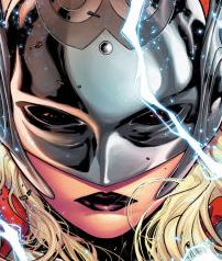 Thor #1
Written by Jason Aaron
Art by Russell Dauterman
Colors by Matthew Wilson
Lettered by Joe Sabino
Marvel
“Rise, my son, and let the hammer be damned. Rise and remember the hero that you are.”
After helming an impressive run on Thor: God of Thunder, Jason Aaron launches his much anticipated new series with an epic first issue that spans all of Midgard. A secret whispered to Thor has caused him to become unworthy of his magical hammer, yet if there is a Mjolnir, there must be a Thor. A mysterious woman takes up the mantle, but this isn’t the new Thor’s story (not yet at least). First, we have to learn what it means to be worthy and witness the fall of a god.
This issue literally takes us from the bottom of the ocean floor to the surface of the moon, and the art spares no expense. Each environment is beautifully illustrated and, as is tradition with Thor comics, has lightning licking every corner of the page. There’s a lot of beauty and power in the new Thor’s costume design as depicted by Dauterman; Marvel has been knocking it out of the park with new female costumes lately (see also: Gwen Stacy Spider-Woman). With a single comic that can give us so many stunning variant covers, a new logo, and a terrifying splash page of frost giants charging across the ocean floor, there’s something for everyone here.
Jason Aaron has made Thor’s journey to this point legendary and truly tragic. Seeing Thor, completely defeated, on his knees begging Mjolnir to move makes you wonder if it can get any worse for him (it can always get worse). In a way, we know how this story is going to end after seeing glimpses of an ancient All-Father Thor, and yet Aaron still holds all these tantalizing secrets that make me ache for the next issue. He also plays with the theme of worthiness here; not only can Thor not lift Mjolnir, but neither can Odin, the one who enchanted the hammer in the first place. So what does “worthy” really mean in this context, and what makes this mysterious woman so different? This book doesn’t feel like a ploy as there are two incredible parallel stories of heroes rising out of the ashes, and I’m equally invested in them both.
Joe Stando is reading…
 Gotham Academy #1
Written by Becky Cloonan and Brenden Fletcher
Art by Karl Kerschl
Colors by Geyser with Dave McCaig
Lettered by Steve Wands
DC Comics
“It’s just the Bat-Signal. Same old thing as every other night.”
The much-anticipated Gotham Academy #1 doesn’t feel like any DC book I’ve read for a long time. In fact, it doesn’t feel much like a large-publisher comic at all. Both artistically and in terms of story, it has more in common with the kinds of books you might find over at First Second, or even serialized online. Trust me, this is a very good thing.
Gotham Academy tells the story of Olive Silverlock, a scholarship student at the prestigious Gotham Academy. Olive has become withdrawn and distant after unspecified events this summer, which has strained her relationships, especially with her boyfriend, Kyle. As luck would have it, she’s selected to be the upperclassman mentor to Kyle’s younger sister, the perky, excitable Maps (MAPS!) Mizoguchi. Maps is energetic and curious, and aggressively (sometimes irritatingly) pushes Olive to come out of her shell. There’s some action and a cameo by billionaire playboy Bruce Wayne, but all in all, it’s a pretty self-contained series so far.
Kerschl’s art is a breath of fresh air. It’s much more lively and animated than the somber “house style” that many creative teams work in at DC, and is definitely designed to appeal to a wider audience. The colors pop, and characters’ designs and expressions are malleable and expressive without going overboard. There’s still an undertone of spookiness and menace, but not in a violent or ghoulish way. It almost feels like Gotham Academy is a little bubble in the DCU, where wanton destruction can’t get in (for now).
This book is one of a couple clearly published to court demographics outside of the usual DC market. It has a lot less in common with even the rest of the Bat-books, tonally, than it does with Lumberjanes, Harry Potter, or even some of the more cerebral TV offerings from The CW. It’s definitely a YA boarding school series, set in Gotham. And I love it. Diversity is the key to making a shared universe successful. Diversity of characters, diversity of genre, diversity of tone. Gotham Academy is a book you can hand to younger readers who haven’t had any experience with major comics publishers, but it’s also a book long-time fans and collectors can get into.
Max Robinson is reading…
 Bucky Barnes: The Winter Soldier #1
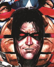
Written by Ales Kot
Art by Marco Rudy
Lettered by Clayton Cowles
Marvel
“<Not my job. Change is an illusion. Play nice.>”
There seems to be a weird little cold war going on between Marvel and DC when it comes to Batman and Captain America. When Steve Rogers died, Marvel had the former Bucky step up and take his mantle. When DC killed off Batman in Final Crisis, Grayson filled in as the Dark Knight. Now, as if in response to Grayson’s new role as a presumed-dead stylish superspy, the fallout of Marvel’s Original Sin dictates that Barnes has to take on his own gig as trippy provocateur in a cape-filled universe. This brings us to Bucky Barnes: Winter Soldier, which sheds a little more light on Barnes’ new environment (outer space mostly) and job responsibilities (“shooting aliens from very far away with huge sniper rifles” and almost nothing else).
First and foremost, your reason for buying this issue should be Marco Rudy’s gorgeous art, whose layouts here are on par with some of J.H. Williams III’s best. Rudy’s decision to go with painted colorwork is inspired and gives his pages a 70s pulp paperback cover vibe that’s perfectly suited to a book like this. His recurring use of “spiral” paneling is occasionally difficult to follow, but you have to admire the craftsmanship and detail that goes into the work here.
Kot’s script for this first issue is, unfortunately, uneven. He deserves credit for taking the series’ conceit and running with it with the exact amount of seriousness it deserves (Bucky is, at various points, almost brainswapped with an alien pig and teams up with Namor to fight undersea drug runners) but much of the humor falls flat. There’s a tendency in the script to throw in distracting background gags or references that also take you out of the plot (the pig alien is a REZNOR, the space station is named HERZOG, etc). That being said, there’s enough crazy cool sci-fi weirdness going on here, art-wise and writing-wise, to keep me on board for the first arc.
Thanks for reading about what we’re reading! We’ll be back next week with a slew of suggestions from across the comics spectrum. In the meantime, what are you reading? Tell us in the comments section, on Twitter or on our Facebook Page!

Deadshirt's writing staff is dedicated to bringing you thoughtful and entertaining media commentary. We're mostly indentured, which means we can pass the savings on to you!
Connect
