Deadshirt Is Reading… is a weekly feature in which Deadshirt’s staff, contributing writers, and friends-of-the-site offer their thoughts on Big Two cape titles, creator-owned books, webcomics and more. For more of our thoughts on this week’s new comics, take a look at Wednesday’s Deadshirt Comics Shopping List.
Dylan Roth is reading…
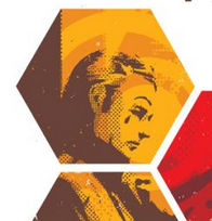
Written by Matt Fraction
Art by David Aja & Matt Hollingsworth
Lettered by Chris Eliopoulos & David Aja
Marvel
“But to actually do good, y’see… Ya gotta BE good.”
At long last, the Hawkeye team returns with another satisfying experiment in the comics form. When we last saw Clint Barton and his brother Barney, they’d both suffered defeat at the hands of the Tracksuits. Now Barney must use a wheelchair and Clint has lost his hearing. As a result, large portions of this issue are “silent,” as we experience Clint’s scenes from his point of view. Speech bubbles are blank, except in rare cases when he can lip-read portions of dialogue. Most notably, several scenes feature sign language sequences, and include no clarification or translation for those who aren’t fluent in ASL.
As we’ve come to expect from Fraction and Aja, this is more than just a stunt or gimmick to bait critics and awards (though their canine POV issue “Pizza is My Business” did take home an Eisner last weekend). This is an issue about communication. We learn in flashbacks that Clint and Barney first learned ASL as children when Clint’s hearing was temporarily damaged by their abusive father. Both then and in the present day, Barney works hard to reach Clint, who’s feeling more cut off and alone than ever, and coach him to stand and fight. There’s an intimacy to their signed conversations–even the readers aren’t privy to the details unless they happen to know sign themselves.
It’s also a story about living with a disability. As artist David Aja said on Twitter on Wednesday, the fact that readers aren’t getting all of the information is part of the point. As we read the story, we’re detached from much of what’s going on. Many of us will have to learn a whole other language (or have someone translate for us) in order to completely understand some of the scenes. It’s possible to follow the story without knowing all of the sign dialogue, but readers who don’t know ASL are missing the details because we aren’t being catered to, much in the way that someone who is hearing impaired might struggle because those around them aren’t considering their needs. This book is extra work, forcing many readers to consider how much we take for granted in the simple act of communicating.
Sarah Register is reading…
Written by Brian Buccellato
Pencils by Werther Dell’Edera, Jorge Fornes, and Scott Hepburn
Colored by John Kalisz, Lee Loughridge, and Jon Proctor
Lettered by Taylor Esposito, Dezi Sienty, and Carlos M. Mangual
DC Comics
“Whatever. Unintended consequences…” “No. These are intended.”
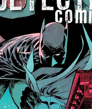
This annual shows a more vulnerable side to Batman while tying in the “Icarus” storyline that began in Detective Comics. The streets of Gotham have been hit with a new drug called Icarus, so-named because a user tends to burst into flames when they overdose (don’t do drugs, kids). Icarus is Harvey Bullock and GCPD’s ax to grind, however, so most of Batman’s battles take place on the periphery. The theme of unintended consequences is apparent throughout the issue, especially when well-meant actions produce rotten results, including an unexpected villain origin.
Instead of giving readers a series of short stories, this annual tells one long story with three teams of writers and artists. Each team controls one plotline, and it’s surprising how well the art styles flow with each scene change. Dell’Edera’s heavy shadows work well for a bruising bar fight, while Fornes’ sharper and more expressive faces bring light to an afternoon lover’s pact. Most impressive, however, is Jon Proctor’s coloring, which somehow manages to portray a pink and turquoise Gotham twilight with a healthy amount of grit and menace.
Long-time Bat fans might find some of Bruce’s actions a little out of character. When he notices visible bruises on a young informant, Bruce takes on his oft-used alias Matches Malone to find the abusive father and beat the snot out of him in a bar bathroom. This seems like a pointless endeavor until you realize that his anger is all tied to losing Damian. Bruce seems to be slipping and breaking his own code to never let emotions interfere with the mission. His missteps will inevitably lead to (wait for it) unintended consequences.
Christina Harrington is reading…
Written by Minty Lewis
Art by Allison Strejlau and Lisa Moore (Colors)
Letters by Steve Wands
“Mordecai and…”
Written and Illustrated by Andy Hirsch
Boom! Studios
“I’m kind of taking an Eileen Day.”
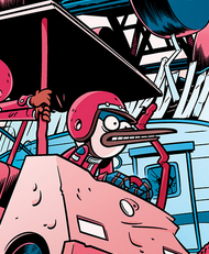
If you watch Regular Show on Cartoon Network or read this comic book, then you know Mordecai and Rigby are two of the worst slackers in existence–by attempting to avoid even the smallest tasks they usually stumble across some supernatural trouble and end up doing twice as much work as they would have if only they’d stuck with their original assignment. While the second story in this issue (“Mordecai And…”, where Mordecai and Rigby have to fight a tree imbued with eldritch power) more closely follows the traditional Regular Show rhythms, I was pleasantly surprised when the main story in this issue eschewed that formula and instead focused on a quiet afternoon with one of the many side characters, Eileen.
This issue is alive with quiet moments and character interactions we aren’t used to seeing. The story is calming and a peek into the life of a character we never see on her own, and who is usually defined by her interactions with the more rambunctious inhabitants of this world. Allison Strejlau’s art serves to highlight the stillness of this issue–focusing closer and closer at the intricacies of a pine cone’s scalloped edges, the miniscule contours of an ant’s back, the similarity between a hummingbird’s body and a particularly smooth pebble. It feels like a meditation on meditation, an affirmation that being alone can be nurturing and not just lonely.
Most importantly, this issue doesn’t shame Eileen for wanting some quiet time by herself or for her needs being different than what her friends need in order to recharge. Throughout the story, Eileen is approached by others who want her to spend her day with them. At one point, Eileen’s father joins her in watching the sun set, but leaves without question or argument when Eileen explains she wants to be alone. There’s a really lovely scene at the end between Rigby and Eileen that works beautifully in showing how Eileen, so different from the loud and over-the-top other characters, can fit realistically in this friend group. I didn’t expect to find a story like this one in the Regular Show universe, and I’m glad that I did.
Kayleigh Hearn is reading…
Written by Neil Gaiman
Art by J.H. Williams III
DC Comics
“Your story. That isn’t what happened. It didn’t end like that. We were cruel.”
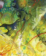
The Sandman: Overture is a massive achievement, so beautiful and elegantly constructed that my disappointment about the series’ frequent delays evaporated into the air as soon as I held the issue in my hands. A story about stories, it slips in and out of genres—though issue #3 could be called both a space western and a fairy tale. Dream of the Endless journeys across a dangerous wasteland at the far edges of the universe, looking for a star that has gone insane, and is accompanied by an enormous cat who is, in fact, also Dream of the Endless. New and familiar faces appear to help Dream (or do they?), but what hope is there for the universe when even the stars can go insane?
J.H. Williams’s art is stunningly gorgeous and complex. While reading, I was so entranced by the juxtaposition of one of the Kindly Ones (dressed like an old prairie school marm) pouring a cup of tea next to a panel of a gigantic space crab, I nearly missed that the entire two-page spread is laid out in the shape of a hand. The heavily detailed wastelands and celestial cityscapes show the influence of Moebius and Jack Kirby, and Williams’s continually shifting art style makes the book feel truly, alarmingly alien. Every panel deserves to be analyzed and annotated—the Space Canine Patrol Corps!—and they form a fantastic whole.
Then there’s Gaiman. Saying something new or revelatory about Neil Gaiman’s work on Sandman is probably futile, but this is his writing at its most cosmic and metaphysical. Prickly, unsentimental Dream must be as familiar to Gaiman as his own shadow, and whenever Dream speaks in those jagged and black word bubbles, it’s like he never disappeared from comics. Thankfully Gaiman still has surprises for dedicated Sandman fans: we finally learn the story behind Dream’s tragic romance with the young woman Alianora, first alluded to in A Game of You. Like most of Dream’s love affairs, it begins like a fairy tale, but his stories don’t have happy endings. In contrast to Alianora, I rolled my eyes at the introduction of new character Hope—Dream seriously isn’t getting a plucky girl sidekick, is he? But she gives Dream someone to talk to who isn’t himself (though Dream the Cat is amazing), and there has to be more to her than meets the eye.
The Sandman: Overture feels like it is moving towards a massive conclusion, despite the bumps in the story and its production schedule. Three issues are left until we find out if the destination is worth the journey, but until then, the scenery is fantastic.
Thanks for reading about what we’re reading! We’ll be back next week with a slew of suggestions from across the comics spectrum. In the meantime, what are you reading? Tell us in the comments section, on Twitter or on our Facebook Page!


