It’s Wednesday and that means new comics. Let Deadshirt steer your wallet in the right direction with reviews (and preview pages) of titles out today from Image, Dark Horse, IDW, BOOM! Studios, Archie, MonkeyBrain, Oni, Fantagraphics, Top Shelf, Action Lab, and more!
Cluster #1
Written by Ed Brisson
Art by Damian Couceiro
Lettered by Ed Brisson
Colored by Michael Garland
Cover by James Stokoe
BOOM! Studios
$3.99
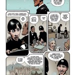
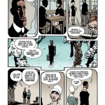
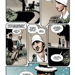
In the future of Cluster, even small offenses like shoplifting can land you a life sentence in prison. But there’s a way out. If you offer yourself for service protecting Earth’s planetary expansion efforts in the space marines, you can cut your stint down to fifteen years. If you survive, that is. We’re introduced to Sam Simmons, who (after an arrest for drunk driving) is assigned to the colony Midlothian to protect terraforming machines from aliens who would rather have the planet for themselves. Soon, she and her team are in deep shit with minimal training and nobody coming to save them.
This book comes across as a blend of Starship Troopers and Suicide Squad. The crew has all been outfitted with a device that will liquefy their innards if they’re off-base for more than 24 hours. Of course, the first issue puts in it doubt whether we’ll see one of our heroes turn to goo before the end of the second. While the concept may not seem overly original, it pays it off well, giving us a tight group of well-realized characters, including a well-designed giant slug-alien marine. I’m sure this book will get mentioned alongside Bitch Planet, since most of the cast is female and it seems as if none of them actually committed crimes that would call for a life sentence in prison, but it’s definitely a more straight-forward sci-fi action book than an exploitation take-off. The art by Damien Couceiro does good work without being flashy; it gets over a lot of dialog without things feeling “posed,” and gets really brutal in the battle scenes. Cluster is a cool book that puts an original spin on some old concepts.
– Jason Urbanciz
(Click thumbnails to enlarge)
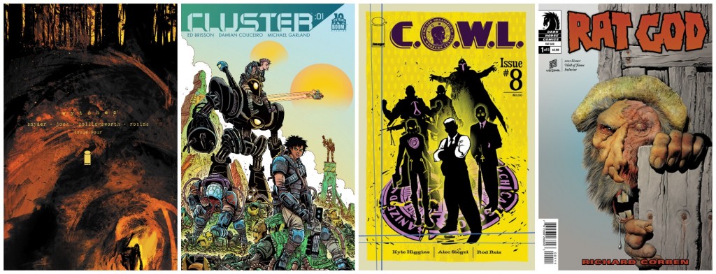
Wytches #4
Written by Scott Snyder
Art by Jock
Colored by Matt Hollingsworth
Lettered by Clem Robins
Image
$2.99
A child’s life has been pledged, and her father is running out of time to save her from being eaten by forest-dwelling nightmare creatures. In the first issue of Wytches, Scott Snyder’s accompanying essay explains that his idea for the series came from his childhood days playing in the woods and making up scary stories, which coincided with the comic’s early focus on thirteen-year-old Sailor. Now, however, the story has shifted its attention to her father Charlie, and his concerns over his daughter and the supernatural events surrounding his family.
Charlie finds himself and the fate of his daughter in the hands of a crazed pledge survivor. The woman’s disfigurement and mental state don’t bode well for Sailor even if she does survive, and Charlie is becoming desperate. In fact, he’s pretty much falling apart, and this is most evident in Jock’s visual direction. The artwork in this issue is deteriorating at a faster rate than before; panels are toppling onto each other or spilling their contents onto the page and into each other like a twisted Chutes and Ladders homage. The heavy color splatter previously reserved for the creepier scenes now occupies every page, building the horror into a steady smolder, and causing me to turn the pages quickly to see what terrors were in store next.
Snyder’s exploration of a father’s anxieties is nearly as nail-biting as the Wytch lore itself. The thought of failing to save his daughter’s life has dredged up Charlie’s darkest memories as a father, touching on painful subjects and revealing the seedier side of their family history. Sailor, meanwhile, is a kid with true grit, and seems more capable of pushing away her own fears to fight the supernatural, though it might not be enough to save herself. An eerie ending to this issue emphasizes that these two truly are alone, as they fight tooth and nail against their personal demons and the monsters that go “chit chit chit “ in the dark.
– Sarah Register
Head over to Comicbook.com for their exclusive preview of this month’s Wytches
C.O.W.L. #8
Written by Kyle Higgins & Alec Siegal
Art by Rod Reis
Letters by Troy Peteri
Image
$3.50
I picked up the first issue of C.O.W.L. on a whim last year, and it was the art that pulled me in at first. Rod Reis’ style subverts Norman Rockwell imagery with moody textures and colors that evoke an immediate emotional response in a reader. It’s a broad statement, I know, but the opening sequence in this issue of C.O.W.L. is proof enough. Arclight’s interrogation, in smoky blue watercolors, is intercut with the frenetic abduction of an alderman by superpowered muscle-for-hire Doppler, which is covered in wild pencils. Doppler has the power to manipulate sound waves, and Reis translates this power into onomatopoeic SFX lettering that physically interacts with characters, kinetically. It’s a really neat choice that reads so well, and the entire series is filled with brilliant touches like this. But it’s the story that’s gonna grab you by the neck and pull you into this alternate 1962.
Kyle Higgins and Alex Siegal have crafted a beautifully paced, ember-slow cop thriller with superpowers. Mad Men seems to be the benchmark for period dramas set in the sixties these days, but C.O.W.L. has an atmosphere all its own. It’s an HBO series waiting to happen; the characters are rich and multifaceted, and the storylines are blended so well. It’s an artful and well-crafted story, and this issue especially moves it further into excellent chaos. Camden Stone has started putting his superpowered goons in masks, at the behest of Chicago Organized Workers League head honcho Geoffrey Warner. It’s a secret move by Warner, in a bid to break through the stalemated strike negotiations with the mayor, to hold the city of Chicago hostage in order to show them how much they need C.O.W.L. In this issue, the Stone gang’s violence crescendos, and it’s clear that the former Grey Raven may have bitten off more than the stymied C.O.W.L. can chew. And that’s just one story thread. There’s still a lot of mystery to be cleared up after last issue’s big John Price reveal, but this issue only deepens it. If you’re not reading C.O.W.L., catch up now.
Also, as though you need more reason to add this series to your list of monthlies, C.O.W.L. has a soundtrack, available on iTunes and Amazon, that somehow involves Bear McCreary. Again, Bear McCreary, composer for Battlestar Galactica and The Walking Dead, is the executive producer on this comic’s jazz soundtrack. If that doesn’t make you want to read this, nothing will.
-Adam Pelta-Pauls
Head over to CBR for their exclusive preview of this month’s C.O.W.L.
Rat God #1
Story and Art by Richard Corben
Colored by Richard Corben and Beth Corben Reed
Lettered by Nate Piekos of Blambot
Dark Horse
$3.99
Rat God is a solid case of something working better in theory than in practice.
The series is supposed to be a fusion of Lovecraft and Native American mythology. The aspect of Native American mythology is evident, but so far the Lovecraftian aspect has been little more than namedropping. We’re not provided with any character motivation or much backstory. We’re thrown into the middle of the story without much of a hint as to what brought the characters to that point. Most of what we know about characters is told rather than shown, and we’re not shown much—the most clearly developed character is a racist white guy from Arkham, Massachusetts, and it’s not particularly hard to write a blatant racist. (I know Arkham’s a place in Lovecraftian lore, but come on, it’s still a cliche.)
I have absolutely no clue what’s happening in this comic, but I will concede that it’s fun to look at. Sometimes things get crowded and the story gets hard to follow, but there’s some clever narrative misdirection used (including a fight scene with a very surprising outcome), and some solid rustic-looking pencils and colors. Corben was clearly going for style reminiscent of telling a legend, and he absolutely succeeded in that. The cover art alone is reminiscent of Glenn Fabry. Unfortunately, it doesn’t make the narrative itself much more coherent.
Maybe this will make sense in the long run, or maybe it won’t. I honestly can’t say at this point, but I won’t stop you if you want to take a chance on this. There are a lot of moving parts right now, but by next issue they may very well fall into place.
– David Lebovitz
(Click thumbnails to enlarge)
Be sure to let us know what you picked up this week in the comments below, on Twitter or on our Facebook Page!

