British writer-artist Dan McDaid made his comics debut in the pages of Doctor Who Magazine with a serialized story fittingly titled “The First.” Trying to pin down McDaid’s style as an artist is tricky; his work has flashes of past masters like Kirby and Eisner with an underlying warmth and arch humor that’s uniquely his. Although McDaid’s since gone on to do work for DC, Oni Press and IDW, lately he’s become a fixture at Dark Horse Comics with art duties on books like Joe Kelly’s Catalyst Comix and, most recently, 80’s movie in comic form Vandroid with writing duo Tommy Lee Edwards and Noah Smith. In anticipation of this week’s release of Vandroid #1, I sat down with McDaid for a breezy chat about the book, his influences and the art of pastiche.
MR: Hi Dan.
DM: Hello, Max. Are you well?
MR: I’m great. I’ve been listening to Prince’s Batman soundtrack on a loop pretty much all morning. And you?
DM: I’m very well. What’s your favourite song off the Batman soundtrack? Mine is “Party Man”.
MR: I’m pretty big on “The Future” right now but there are like no bad songs on that album.
DM: “Hubba hubba hubba money money money”. I love that film.
MR: In three words, break down Vandroid for our readers.
DM: I’m going to give it to you in two three word sections, if that’s okay:
“A Deadly Weapon
(from)
The Betamax Age.”
MR: After reading the first issue, I think that’s just about right. I love how authentically 80’s Vandroid feels. Which I realize is the point since it’s a “lost” 80’s film.
DM: I’m really pleased that’s come across.
MR: Even ignoring stuff like the great Spielberg movie-y swears the kids have, the exaggerated gore in the book is such a great throwback to stuff like the original Terminator or John Carpenter flicks.
DM: The aim was to make something authentically edgy… but edgy in that way that the eighties thought it was edgy. Blue chrome, a synth soundtrack, fingerless gloves. Yeah, and pretty gory. There’s a sequence that ends part two and sprawls into part three that’s pure video nasty. Things get pretty hairy with a biker gang, let’s put it that way.
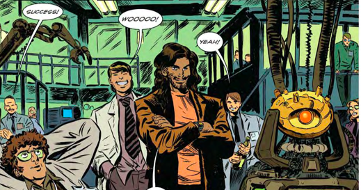
MR: The bit in the first issue where the “Horizon” intelligence tears the lab apart felt like pure Sam Raimi/Evil Dead 2 horror.

80’s scumbag Taylor oversees the birth of the “Horizon” AI. Art by Dan McDaid, colors by Melissa Edwards.
DM: Bingo. There’s a panel in that sequence, and I bet you’re thinking of this one too, where the scientists are getting hauled up into the ceiling by the cables, and that was me going “Yeah…Raimi”.
MR: Yeah! That was it! Haha.
DM: And Taylor’s dialogue there is so brilliantly hammy “…No… It’s MORE than that”. I loved drawing that sequence.
MR: Yeah, Taylor feels like such a perfect 80’s scumbag, eating sushi and plying dudes with cocaine. He probably plays racquetball with Bob Morton on the weekends. Are there are pitfalls to avoid when you’re trying to work in a deliberate time-specific aesthetic like “the 80’s”?
DM: Taylor spends the weekends with Bob Morton and every other Wednesday with Ellis from Die Hard. I think the main thing to watch out for is… you want to be echoing how people feel about the eighties without straight up ripping anything off. It has to feel like a new thing in its own right, but where the roots are showing, if you know what I mean.
MR: Yeah I think I get that. It’s the difference that makes something like Black Dynamite work versus, I dunno, Scary Movie.
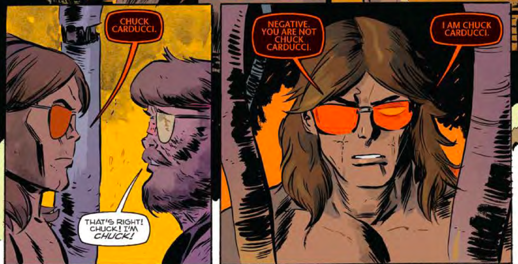
DM: Yeah, that’s exactly it. Vandroid is funny, and people will get a laugh from reading it, but I really like the Raimi thing of “here’s a laugh, and here’s a scare, and holy shit here’s a bit that made you cry”. So there’s a bit more to this than just a spoof. It’s all about walking a line. I think the script is really smart and plays it admirably straight. Vandroid himself is the ultimate straight man. He never flinches, no matter how weird things get.
MR: Yeah, I had no idea going in it’d have these kinda horror overtones to it but I’m really glad that was part of it rather than just a “throw jokes out there and make a script around it” sort of thing.
DM: Right, yeah. The savvy reader will get a kick out of the references and the whole kind of throwback vibe, but there’s a story going on here. There is – and I hate to say this, because it’s cheesy – there’s a bit of heart. A gleaming chrome heart.
MR: Did you do any kind of visual research before you started drawing Vandroid or did it all just flow from you naturally?
DM: Yeah, particularly for issue one and two. There was a particular setting Tommy and Noah wanted to evoke, a particular kind of grubby, down-at-heel eighties culture. And then the mall stuff in issue two, I tried to get the fashions right, and throw in some of the store names you might’ve seen back then. But most of the research has been conducted across my lifetime, you know? I was born in the seventies, so the eighties and early nineties is my home territory.
MR: One thing that struck me, and maybe this is a total coincidence, but I felt like your art had a really strong resemblance to what Keith Giffen did with the most recent OMAC series at DC? Some of it’s textures but even stuff like the design of the Horizon “brain” has a nice Brother Eye vibe.
DM: I love Giffen, as all right-thinking people should. But it’s probably just a coincidence. I do see it though, now that you mention it. There’s something to the Buddy Blank/OMAC to Chuck Carducci/Vandroid parallel.
MR: I hadn’t made that specific connection either but wow now I totally see it.
DM: I think Giffen and I both have a tendency to draw things that are in a state of cataclysmic decay. Like paint peeling explosively off walls. Robots staggering towards the reader, chunks falling off… there’s quite a lot of that in issue four.
MR: Yeah, the lab scenes in this and from those nu-52 OMAC issues definitely have this kinda frayed wire, held together with bubble gum million dollar facility look that I love. When you were designing the characters, did you do it with any specific actors in mind? Vandroid reminds me of Rowdy Roddy Piper.
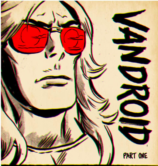
DM: Man, that’s great. That really pleases me. Tommy sent me a LOAD of reference pics for the characters, and they helped me narrow down a look we all liked. With Vandroid, there *may* have been a pic of RRP there… though the one that sticks in my mind is Marc Singer. Particularly in V. Did you ever watch the original V?
MR: I confess I was too young to catch V. But I remember seeing VHS covers for Beastmaster. So I definitely see the Singer influence.
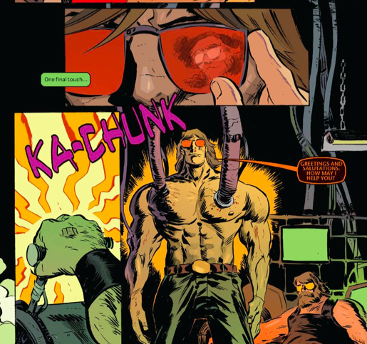
DM: Singer’s huge. What a hero. In V, there’s a long sequence where he’s dressed in the aliens’ red uniform and he looks so kind of campily cool… like it’s clearly absurd, but also sort of wonderful. He kind of looks like a toy, if you know what I mean? Like you see this thing and your first thought – at least *my* first – was “where do I get the action figure?”. Hopefully Vandroid has some of that same quality, people should want to own the toy.
MR: Oh yeah, I love how you captured that weird impossible buffness that was just everywhere 30 years ago. He-Man. Schwarzenegger.
DM: Yeah! He’s enormous. And everyone’s like “Chuck, you look well! REALLY well.”
MR: To double back abit, what was the collaboration between you, Tommy and Noah like?
DM: Initially quite a lot of back and forth in terms of refining the characters looks, getting the setting right, making sure we were all pulling in the same direction. And then, as the project went on, Tommy and Noah stepped back a bit and let the artists – me, Melissa Edwards our awesome colourist and the legendary John Workman do our own thing. That’s really brilliant, being given such free reign. With the first issue I think I was almost a little timid with it, but things really start to bust loose as the series goes on. I’m drawing issue four right now and a) the script is fucking *wild* and b) it gives me lots of room to get even wilder. I love it.
MR: I’ve loved Workman’s letters since I got into Simonson’s Thor run. Melissa’s colors really suit your pencil style, I think.
DM: Oh yeah. When I saw the first few pages with the colours and the lettering in place… holy balls.
MR: The mostly muted colors work really well, there isn’t a total overload of pink neon or anything like that.
DM: There’s a sequence at the beginning of part three, which takes place in this kind of open desert plain, with an armoured truck, and a medieval biker gang and a Horned God, and wow, Melissa just knocked that out of the park. Like you say, kind of restrained almost, warm tones, nothing OTT or gaudy. Almost Euro comics style. It really makes the art sing. If it was me colouring it I would’ve made everything stupidly pink and blue and day-glo and it would’ve sold four copies.
MR: While I have you here, is there anything else you wanna promote?
DM: Well, this is my main thing at the moment. I eat, sleep and breathe Vandroid. So I’ll promote this while I’m here: everyone who buys this book will have a f*cking good time. Please put that in bold, Max.
MR: I’ll see what I can do.


