Deadshirt Is Reading… is a weekly feature in which Deadshirt’s staff, contributing writers and friends-of-the-site offer their thoughts on a diverse array of comics, from name-brand cape titles to creator-owned books to webcomics.
Jen Overstreet and Christina Harrington are reading…
For this week’s launch of Boom! Studios’ Lumberjanes, Deadshirt staffers Christina Harrington and Jen Overstreet reviewed the first issue in conversation.
Lumberjanes #1
Written by Noelle Stevenson and Grace Ellis
Art by Brooke A. Allen
Boom! Studios
“What whacked-up eyes you haaaaave!”
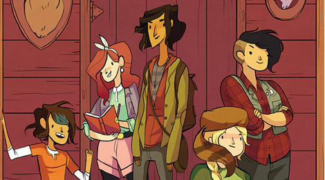
JO: Lumberjanes opens with an image so familiar I actually didn’t register it until a second read: a petite girl, in a red hood and cape, about to be set upon in the dark dark forest by scary beasties!
CH: I loved that iconography right in the beginning and then the immediate reversal and shutdown of the story we think is going to come next. Instead of the girl in red being victimized by a wild animal, she teams up with her friends and kicks total butt. If that doesn’t exemplify what the rest of this series is going to be like, I’ll eat my socks.
JO: I’m excited that this series really seems like it could be ENTIRELY female. It’s a camp for girls and so far we’ve only met female staff. There’s the possibility of male staff or villains, but I wouldn’t be surprised if they just eschew male characters entirely.
CH: They seem to be isolated enough that men/boys never need to come into the story. It’s a girl’s camp, as clearly defined by that giant sign in the issue, so why would they even bring dudes into it? I’m excited for that to be the case so we can get female heroes, but also female villains and, possibly, female love interests.
JO: I don’t know if I was reading too much into it but I thought there might be a nod where the characters are all named after female pop culture icons — Jo, April, Ripley…
CH: Yes! The second Ripley showed up I was just like HELL YES and she totally lives up to her namesake, I think, while remaining an entirely unique character.
JO: And Rosie!
CH: Rosie the Riveter!! Yes!
JO: A key panel for me in setting my expectations for the series is the girls in their uniforms, where they are all slightly differently styled — a touch of girliness here, tomboy here, a little straight-laced or rumpled there. It reminded me of a twitter convo about how Sailor Moon had an unprecedented amount of main female characters, and yet they were all able to have their own unique personalities. When you have a large cast like this, you can’t spotlight all of the characters at once. It seems like Lumberjanes could have a good idea of how to build these characters up through small details and interactions.
CH: That panel was a great, tiny moment that showed their personalities really well. Sailor Moon has influenced our generation quite a bit and I think that (mixed with a bit of Adventure Time) is how I see this comic book, as a bit of a spiritual successor I guess?
JO: Yeah, it seems like the latter is probably more Stevenson’s and Ellis’ influence, but I refuse to talk about an all-female book without bringing Sailor Moon up, what other reference point do we even have for an all-female cast that isn’t a superhero spinoff?
CH: Not only am I psyched to see an all-female cast and creative team, but the story hits all of my buttons. A supernatural mystery? Foxes with three eyes? CRYPTIC FOREST GALS? Yes, yes, yes. I already pre-ordered issue two at my LCS after they sold out of one, so someone is doing something right.
JO: Lumberjanes is working in the tradition of a lot of books I liked as a kid (The Time Warp Trio series comes to mind), which encouraged (boy) kids to have adventures, break rules, and get up to no good. It’s exciting to see some rambunctious camp fiction with an all-female cast, and it’s a writing team I feel in good hands with.
Max Robinson is reading…
Written by Michel Fiffe
Art by Amilcar Pinna and Nolan Woodard (colors)
Lettered by VC’s Clayton Cowles
Marvel
“‘Leads.’ I love this.”
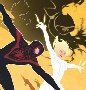
Back when it was Mark Millar and Bryan Hitch’s baby, The Ultimates was an attempt to tell superhero stories in the shadow of 9/11. In between the US’s involvement in two different international wars, the Avengers of the Ultimate universe became less a friendly gathering of peers and more a sort of super-powered national security force. Ten years later, COPRA creator Michel Fiffe has, astoundingly, reverse-engineered this concept to its core: in the wake of Earth’s near destruction, The Ultimates are now a grassroots teen superhero team that operates in a rundown church. Millar’s Ultimates were the Bush years; it’s fitting that these Earth’s Mightiest Heroes are a group of young people fighting corporate interests and picking up the pieces after the failures of an older generation.
In the back of the issue, Fiffe cites movies like Death Wish as an influence on the story he wants to tell in All-New Ultimates and this accomplishes something very curious: Ultimate New York City now resembles the crime-ridden hellscape we associate with 70’s and 80’s era NYC movies like say The Warriors. It’s a clever way to evoke tone while doing something new and it’s fitting that in this first issue, we watch as The Ultimates face-off against their ideological counterpoint, a deeply rooted street gang called The Serpent Skulls (trading off some pretty familiar iconography for their insignia).
Even beyond all that, this first issue was extremely promising. Fiffe’s teenagers walk and talk like teenagers, some interesting plot threads have been put in place, and it’s genuinely thrilling to read a book from a Big Two publisher where almost anything could happen. Pinna’s pencils in this issue are a good fit for the story Fiffe is telling, although I’ll admit I found some of the action towards the end of the issue cluttered and hard to follow. Art-wise, it’s Nolan Woodward’s appropriately neon-soaked colors that really makes these pages shine.
Marvel is putting out some bold, exciting books right now. All-New Ultimates is poised to lead the pack.
Written by Jeff Parker
Art by Marc Laming and Jordan Boyd (colors)
Lettered by Simon Bowland
Dynamite
“That would be me, your loserness — Flash Gordon!”
Jeff Parker and Marc Laming’s relaunch/reboot/whatever we’re calling licensed property wrangling these days of classic King came to a close on a really strong note this week. Kings Watch features characters like The Phantom, Mandrake The Magician, and Flash (AAAHHH) Gordon. This last issue finds the pulled-together-by-fate pulp hero team semi-successfully thwarting a global invasion of Earth from Ming The Merciless’ alien armada, only to realize that shutting down Ming’s interdimensional portals comes with a high price.
The cool thing about Kings Watch as a whole is that Parker’s take on these characters feels incredibly fresh despite most of them being 70 year old newspaper strip characters. His kindhearted thrill junkie interpretation of Flash Gordon or the charmingly pragmatic immortal Mandrake are all unique twists on characters who’ve been around awhile (he even manages to add some unique wrinkles to the Phantom mythos here). In issue five this all comes to a head as we see some characters die, some characters get stranded behind enemy lines, and a reshuffling of threats once the dust settles.
I’ve compared Kings Watch to the initial storyline of nu-52 Justice League relaunch before and, now that it’s over, it’s impressive how this was more successful at setting up a new universe of characters, even clocking in at way fewer pages.
Laming’s art throughout this series has done a great job of translating Parker’s script and there’s a lot to dig visually in this issue, from Ming’s peacock-y tyrant uniform of office to the grizzled Phantom punching out a lizardman through its own broken space helmet.
If you missed out on Kings Watch or, like me, were left wanting more, the first issue of Parker and Evan Shaner’s super-fun Flash Gordon also shipped this week and it literally picks up right where this issue ended.
Dylan Roth is reading…
Written by Peter Milligan
Art by David Lafuente and Laura Allred (colors)
Lettered by VC’s Clayton Cowles
Marvel
“There’s a green… potato-looking… thing that lives with the X-Men. He is.. DOOP.”
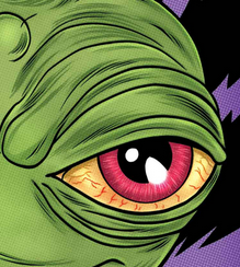
Doop is a silly, mysterious side-character in the X-Men mythology. He speaks an indecipherable language, his powers and origins are completely undefined, and he looks like a pickle. He’s a lovable little spud, and part of his appeal comes from the fact that he typically acts completely independently of the main story and only in very brief appearances. Since his debut in Peter Milligan & Mike Allred’s X-Force back in 2001, he’s popped up in numerous titles, but this is the first time Doop has been the sole lead of his own book, and this is the most Doop we’ve ever gotten all at once.
This issue, and presumably the whole miniseries, takes place during the recent Battle of the Atom event, and I’m afraid this story will probably not make much sense if you haven’t read that one already (most of it is on Marvel Unlimited). Like in his last big story in Wolverine and the X-Men #17, All-New Doop plays with the idea that Doop is an essential but unnoticed member of the team, solving the tiny (or unimaginably cosmic) problems that would get in the way of the X-Men doing their hero thing. During the time-travelling madness of BotA, Doop is… well, he’s stalking Kitty Pryde, but he’s also subtly guiding the main characters and making sure they can get where they need to be for the bigger story.
I won’t spoil what little plot there is to this first issue, except to warn you that if you’re not interested in seeing a weird green blob thing literally tear his own guts out then this is probably not the book for you. For most of the book (the non-guts-tearing part) David Lafuente’s art is heavy on the cartoonish cuteness. Doop has never been more adorable than in this issue — he’s much less pudgy and drowsy-looking than in his original X-Force appearances. It’s the energy in Lafuente’s art that really keeps the book moving, especially since there’s not much new story so far.
Will Doop stay fun as the center of a longer story rather than a goofy distraction? That remains to be seen, but with this first issue Milligan and Lafuente are off to a pretty good start.
Jason Urbanciz is reading…
Written by Kurt Busiek
Art by Brent Eric Anderson, Alex Sinclair, and Wendy Broome (colors)
Letters and Design by John G. Rochell and Jimmy Betancourt of Comicraft
Vertigo
“I remember thinking the day was actually under control for a change.”
Since its return last year, Astro City has seemed very interested in the mechanics of superheroing, mostly focusing on the people behind the superheroes that answer the phones and keep massive justice organizations humming so the super-powered folk can be out there on the front lines. This week’s issue is a great done-in-one issue example of this. The Silver Adept is Earth’s champion sorcerer (actually the champion of many, many dimensions and realities) and with that comes a lot of responsibility and requires a good deal of time management. This brings us to her assistant, Kim, who answers her e-mail, sets her appointments (when the Adept can remember to write them down) and otherwise keeps the world in existence by reminding her boss when she has to reset the magical words that keep the elder gods at bay.
Busiek and Anderson do their usual excellent job of showing how day to day life in a superhero universe is very like our own, only the stakes are much higher. Instead of Johnson in Sales whining about his expense report being rejected, Kim has to deal with demonic others demanding their newborn deity be delivered to them. Anderson excels at drawing real people, not the usual idealized specimens you see in cape comics. Kim looks like an actual everyday human being and that grounds the story, even though she’s interacting mostly with a Minotaur surrounded by a sentient swarm of bees.
Astro City is consistently one of the best superhero comics coming out, I can’t believe that literally everyone isn’t reading it. If you’ve been interested before, this is a good single issue to pick up to get a feel for the series.
Joe Stando is reading…
Written by Joe Keatinge
Art by Ramon Villalobos (pencils and inks) and Ruth Redmond (colors)
Marvel
“I gotta hand it to you, Hulk. The Shaolin monk thing’s working for you.”
Marvel’s What If? books have always been fertile ground for new ideas and new takes on characters. Freed from the confines of ongoing continuity and status quo, it allows creators to write end points or bold new directions to previous stories without worrying about killing the golden goose. One problem with this, I feel, is that too often their imaginations are limited to catastrophic, world-ending events. A ton of them lead to dystopian worlds that are a bit too extreme, and I’d prefer something a little more creative.
What If? Age of Ultron #2 is just what the doctor ordered. Rather than retell a version of the event where Things Got Worse, it utilizes the time travel element to make an interesting new status quo. An Earth-shaking war did take place, there were casualties, but that’s in the past. The story has kind of a “getting the band back together” feel to it, and it’s a clever riff on the classic “substitute Fantastic Four” story.
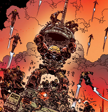
The real selling point is that it’s drawn by Ramon Villalobos, one of the strongest, most unique new talents in comics today. Villalobos has an eye for great designs and details, and this issue definitely plays to his strengths. The story includes Wolverine as a salty sea dog, Ghost Rider on a hoverbike, and a Shaolin monk Hulk. It’s really fun, and definitely a diamond in the rough this week. Check it out, so you can say you were a fan of Villalobos before he got big.
Thanks for reading about what we’re reading! We’ll be back next week with a slew of suggestions from across the comics spectrum. In the meantime, what are you reading? Tell us in the comments section, on Twitter or on our Facebook Page!

