Deadshirt Is Reading… is a weekly feature in which Deadshirt’s staff, contributing writers and friends-of-the-site offer their thoughts on a diverse array of comics, from name-brand cape titles to creator-owned books to webcomics.
Max Robinson and Joe Stando are reading…
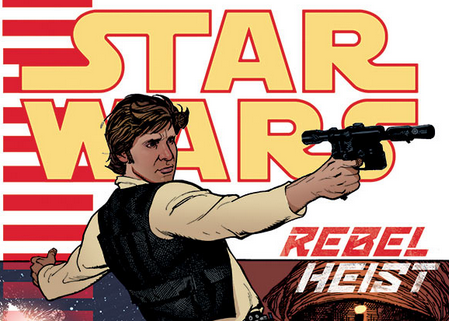
This week saw the release of Star Wars: Rebel Heist #1, one of the last few Star Wars comics Dark Horse will put out before they lose the license to Marvel later this year. Earlier this week, Deadshirt’s Joe Stando and Max Robinson discussed their thoughts on the first issue.
Star Wars: Rebel Heist #1
Written by Matt Kindt
Art by Marco Castiello, Dan Parsons (inks) and Gabe Eltaeb (colors)
Dark Horse
“This sure as hell ain’t The Falcon.”
Max Robinson: So I liked this issue a lot? There was some surprising complexity for…uh a Han Solo comic?
Joe Stando: I did too! It definitely had an old-school Expanded Universe feel, which is kind of funny, considering how much of it has apparently been excised.
MR: MOURN YA TIL I JOIN YA, PRINCE XIZOR.
JS: Hahaha. The thing I liked about it is that it felt lived-in, which a lot of Clone Wars stuff lacks.
MR: The first person point of view was a pretty clever way to do this sort of thing and it didn’t feel like a gimmick?
JS: Yeah, I like that even though WE know who Han Solo is, we’re still kind of unsure what his deal/plan is in this issue.
MR: And that’s not even answered by the end of the issue!
JS: You get a good sense of how the viewpoint character’s perception of him is changing, even by the minute. I imagine a “heist” is coming, but it doesn’t feel like it’s been obviously telegraphed. It’s like a magic trick.
MR: We still don’t get clued in on what’s happening totally except that the viewpoint character is a huge weenie and Han is kinda playing him.
JS: Yeah, I like him as sort of the fanboy who thinks he’d be great in the Rebellion but ends up just making things harder. It reminds me of nerds who have detailed “zombie apocalypse” plans. The fakeout with the Millennium Falcon is pretty great too. The way it’s written, you think “well, maybe Han is just being real honest about it,” and then it does that exterior shot and he’s like “Are you kidding? This is a terrible ship! It’s nothing like the Falcon!”
MR: Yeah that was so good. I was like “Oh, is this like a fake Han?” That was a great way to play off a little thing we KNOW about Han from the movies without it being a gratuitous reference.
JS: Yeah, exactly, especially since the main character pretty much never decides on his impression of him. “He’s an improviser!” “He’s a tactician!” “He doesn’t care if he lives or dies!” Which are all kind of true, to a point, but it’s clear Han is a hard guy to get a definitive read on.
MR: The POV character thinking he has him nailed down is pretty funny, sorta wondered if that was Kindt’s way of poking fun at the reader/fanbase maybe?
JS: Yeah definitely. I feel like it’s even a critique of other writers’ portrayal of the character, maybe. Han Solo is a character we all know really well, but he’s kind of hard to describe in absolutes.
MR: How’d you like the art? I liked the Chaykin-y vibe.
JS: Yeah, it felt sort of old-school in a way that I liked and was appropriate. Good sense of motion and action too.
MR: I really liked the details with the alien strippers being like….abstract bug creatures. Although I gotta say having the main character go “WHAT THE WHAT” to that undercut the joke a little.
JS: Yeah I would’ve preferred to have him be like “Ah, a couple of classier dancers.” That was one issue with the guy being clearly out of his depth, it was maybe too much of “the Star Wars universe is strange and alien.” But the centipede doing a pole dance was maybe my favorite part.
MR: Man, I hope Dark Horse uses that as a pullquote, Joe.
JS: I want an over-sized one-shot about his/her career, rising from an Outer Rim planet to the finest clubs on Corellia.
MR: I do really appreciate that we’re one issue in and it’s not at all clear what this heist will be.
JS: Yeah, this was a clever way to start, rather than a meeting planning it out or getting a team together, like these stories usually go. It helps keep the mystery up, rather than doing the usual “double-twist” format.
MR: It was nice to not get a “heist” comic that’s not just aping Ocean’s Eleven gags either, as is often the case.
JS: Agreed. And I’m sure we WILL get some more classic heist moments as it goes on. No need to front-load them.
MR: I think the last thing I’ll say is that this issue really reminded me of the old Star Wars Tales anthology Dark Horse used to do, in terms of being a non-traditional Star Wars comic that you can go into pretty cold.
JS: Yeah, it’s definitely one of those stories that just plugs in, versus one that requires knowing who Grand Admiral Thrawn is or anything. Pour one out for that guy, by the way.
MR: No, fuck him.
JS: Any guy who can rise that far in the ranks despite obsessively bringing his cat to work every day is A-OK in my book.
Sam Paxton is reading…
Written by Frank Gibson and Ian McGinty
Art by Becky Dreistadt, Lorena Gomez, Audra Furuichi, Mad Rupert and Fred Stresing
Lettered by Britt Wilson and Fred Stresing
BOOM Studios
“Poison cake! What a butt!”
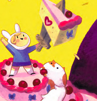
While the Adventure Time television show has grown subtly darker and more serialized, the comic book adaptation has remained relatively light-hearted, emphasizing one-off stories that don’t follow much of a continuity. So it goes with Adventure Time’s 2014 Annual, a charming issue devoted to the toddling adventures of (gender-swapped versions of Finn and Jake) Fionna and Cake.
The book is comprised of one central story and several single-page anecdotes. The main story, “Baby Cakes,” is particularly lovely. Becky Dreistadt’s pastel illustrations are gorgeous and full of life, staying in character with the source material without directly aping the animation style, and would look right at home in a children’s story book. The plot is a bit of fluff, with a five-year-old Fionna on the eve of her birthday, discovering that the Ice Queen from her nightly stories is real rather than a fictional character. The Ice Queen has kidnapped young Prince Bubblegum and imprisoned him in a giant candy maze. Fionna hastily rushes to his rescue, despite Cake’s best intentions. Through teamwork and Cake’s shape-shifting powers, she easily saves the day (sounds like every episode of Adventure Time circa Seasons 1-3) and everyone shows up for her birthday party the next day. Hooray!
The one-page stories are even less consequential, and the main part of their appeal is that they show fun little vignettes of gender-swapped versions of ancillary AT characters: Lady Lemongrab makes yellow snow, Fionna and Marshall Lee write a song about tacos (in Portuguese, no less!), and Lumpy Space Prince is trying to grow a sweet manly ‘stache. While each page is basically setup and one punchline, they’re funny enough that each one doesn’t suffer from lack of elaboration.
The greatest achievement of the Adventure Time comics is that the writers and artists manage to flawlessly translate the comedy and inherent weirdness of Ooo from screen to page. “That guy was a big baby cause he didn’t ask for help,” says Cake after saving Fionna’s butt from bloodthirsty penguins. In the next panel, the penguins are chewing on a skeleton wearing a t-shirt that says “BIG BABY.” As someone whose craving for Pendleton Ward’s madcap creation is never slaked by 10-minute installments once a week, I find the comics to be a perfect compliment.
Kayleigh Hearn is reading…
Written and Drawn by Seo Kim
Koyama Press
“You put me on speaker? …You don’t love me.”
Cat Person collects Seo Kim’s autobiographical sketches and comic strips, many originally posted on her Tumblr. The book takes its title from the first section of comic strips about Kim and her cat Jimmy, which are charming and relatable. Cat stealing her chair and refusing to move? Cat meowing plaintively that their already-full food bowl isn’t full enough? As another cat person, I found myself smiling and nodding along with Kim’s keenly observed comics. Kim is also a storyboard artist on the animated series Adventure Time (including the similarly cat-themed episode “Box Prince”) and that same sense of whimsy can be found in her loose, expressive artwork.
The rest of the book follows Kim herself, her struggles with her art and inspiration, and her long-distance relationship with her boyfriend, Eddie. The internet has no shortage of autobiographical comics, but Kim’s imaginative perspective makes her comics feel charming and new; for example, the one-page strip where the sight of teenagers making out in a café turns a disgusted Kim into a monster vomiting black ooze. If you’re a fan of animals, Adventure Time or slice-of-life comics, consider becoming a Cat Person.
Jason Urbanciz is reading…
Vandroid #3
Written by Tommy Lee Edwards and Noah Smith
Art by Dan McDaid and Melissa Edwards (colors)
Lettered by John Workman
Dark Horse
“DON’T TALK ABOUT MY MOTHER BOARD”
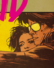
Continuing on their adaptation of the “lost” ultimate 80s action movie, Tommy Lee Edwards, Noah Smith, and Dan McDaid opens with our robot hero (the Vandroid of the title) doing battle with a viking-themed biker gang. If that does not sound interesting to you, I can’t help. From there, Vandroid ponders his lost humanity, reminisces about high school, tries to come to terms with his ex, and faces down the bad guys.
Vandroid continues to be a great call-back to the days when kids who couldn’t get into R-rated movies could run down to the video store and get whatever movie they wanted–mostly awful ones that focused all their quality on creating an amazing 5-by-8 inch billboard in the form of the box art. Fortunately, Vandroid rises above these by including a coherent story and great “performances” by ways of excellent art by Dan McDaid. McDaid and colorist Melissa Edwards add a pulp noir aesthetic to the book that raises it above its B-movie setting. McDaid’s art is really something special here; in the past you could always pick out the Kirby influences, but as this issue goes on his style gets looser, moving into a more Paul Pope vibe as Vandroid faces down the legion of thugs. Edwards’ shift of color palette from orange-y earth tones at the start, to more cold blues and greens at the end help highlight that.
With Vandroid and other projects like Kyle Starks’s SEXCASTLE, 2014 seems to be the year of the 80s action movie revival and since that was formative for me as a child, I welcome it.
Thanks for reading about what we’re reading! We’ll be back next week with a slew of suggestions from across the comics spectrum. In the meantime, what are you reading? Tell us in the comments section, on Twitter or on our Facebook Page!


