Deadshirt Is Reading… is a weekly feature in which Deadshirt’s staff, contributing writers, and friends-of-the-site offer their thoughts on a diverse array of comics, from name-brand cape titles to creator-owned books to webcomics.
Jason Urbanciz is reading…
Written by Brian Azzarello, Jeff Lemire, Dan Jurgens, and Keith Giffen
Art by Patrick Zircher, Keith Giffen (breakdowns), and Hi-Fi (colors)
Lettered by Dezi Sienty
DC Comics
“I’ll live, though…technically, I won’t for, what — at least a few more years?”
Futures End #0 was a hot mess of garbage, let’s get that out of the way. The first issue has to be a step up right? There is no way it can be as bad or even worse, right? Well, it’s better, a lot better even, but it’s still completely bizarre.
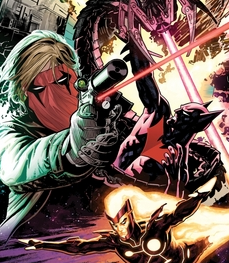
At the end of #0, Batman Beyond was thrown back through time in an attempt to prevent his dystopian future from ever happening. However, he arrived seven years too late to do what he was supposed to do, and is now arguing with Computer Alfred on a rooftop about what to do next. Meanwhile, The Authority all die in the expanse of four pages. Then we watch Grifter kill a family of three (but it’s okay, they’re not human). Also, Firestorm! And Green Arrow! But he’s dead, too.
There’s a lot of setup and no payoff in this issue, but that’s forgivable because weekly comics can play by different rules. Rather than having to allow some kind of closure each issue, they can bait you along for the seven days till the next installment shows up. Of course, that relies on hooking you enough to come back and I definitely was not hooked. Much like Batman Beyond himself, this is a comic thrown through time, but not from 1998 instead of the future. Nothing in this comic would be confusing to anyone who was a DC fan back then, the most popular characters of the 90’s (The Authority, Grifter) are all front and center. Even Firestorm and Green Arrow most resemble what they looked like back then than their more recent New 52 appearances. I have no doubt this book would’ve been huge during the Clinton administration, but today it’s just a weird artifact.
Patrick Zircher’s artwork is the best thing about this comic: very kinetic superhero storytelling. I think the reason this comic holds together so well is that both Zircher (and Keith Giffen on breakdowns) give it a very consistent feel across four different storylines. I can imagine with the rigors of weekly art deadlines, this may be the best this comic ever looks.
Futures End #1 is not an objectively bad comic. It’s actually pretty good, but it’s impossible to recommend simply because it’s so out of time from current comics. This isn’t a nostalgic throw-back to the crazy 80’s like Toim Scioli’s GI Joe/Transformers, but a relic from a time most people regard as the nadir of superhero comics. I guess DC is just desperately trying to set the wayback machine to those days of market dominance, but I just don’t think the way to do that is to look backwards rather than forward.
Written by Charles Soule
Art by Javier Pulido and Muntsa Vicente (colors)
Lettered by VC’s Clayton Cowles
Marvel
“TINY GREEN WOMAN, YOU HAVE BEGUN TO IRRITATE DOOM”
From one throwback to another, but this time a more welcome one. Last issue ended with Doctor Doom whisking his wayward son back to Latveria after She-Hulk had just won him political asylum. Naturally this sticks in our hero’s craw and she seeks out some legal advice from Marvel’s other lawyer-superhero Daredevil. She-Hulk eventually comes to grips with a way to diffuse the situation using both her superhuman strength and her brilliant legal mind.
The beauty of this comic is that that’s only about half of it; it reminds me of 60’s era Marvel comics where stories would begin in one issue, wrap up midway through the next and then springboard into the next story arc. I have a feeling that another writer would have turned this Doom story into a six issue, trade paperback-compatible mini-epic and it wouldn’t have been half as good. In the last few months, Charles Soule has seemingly popped out of nowhere to writing half the books hitting the stands on a given week and this comic shows why. It’s smart, witty and makes its point and moves on without belaboring it, like a good lawyer, really.
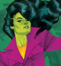
Soule is aided by Javier Pulido who does fantastic work here, expanding each page with fabulous panel layouts that catch your eye enough to slow you down to better enjoy the story. I love the way he draws She-Hulk’s face as an almost perfect circle which sets her apart from the rest of the characters. Like she’s a Kirby creation appearing in a Ditko book.
Each issue of She-Hulk so far has been mostly self-contained, while pulling along a central plot that’s been in the background the whole time. It seems that Soule is moving the mysterious “blue file” to the front burner now, but what’s nice is that it’s impossible to know where it will go next.
Kayleigh Hearn is reading…
Written and drawn by Becky Cloonan
Lounak Press
“But the curse was already in my breast. It blackens and consumes. Its corrosion transforms me.”
By Chance or Providence collects three of Becky Cloonan’s acclaimed, self-published mini-comics (“Wolves,” “The Mire,” and “Demeter”) for the first time in hardcover. All three stories delve into a dark and fantastical realm: in “Wolves,” a hunter pursues a mysterious beast, haunted by the memories of the woman he loves; in “The Mire,” a young squire journeys to a haunted castle to deliver a fateful message; and in “Demeter,” a woman living by the sea hides a secret about her lover.
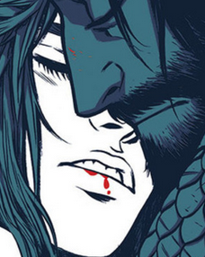
Cloonan’s artwork is both beautiful and terrifying, like a Poe short story illustrated by John William Waterhouse. Her women are luscious and her men are chiseled; her protagonists all yearn for something they’ve lost or can never have. Horror lovers will recognize the familiar settings — dark woods hiding a monster, an abandoned castle with a horrible secret — but Cloonan’s artwork gives each story a palpable atmosphere and they feel like new and undiscovered territory.
Becky Cloonan is best known for her comic book art (her collaboration with Gerard Way and Shaun Simon, The True Lives of the Fabulous Killjoys, is also collected this month), but By Chance or Providence shows that she is an adept writer as well. The book collects some of the best dark fantasy comics of the last few years, and they rely on the characters, concepts, and artwork rather than cheap scares, gore, or titillation. Even better, this hardcover edition is packaged beautifully, with a new introduction by Scott Snyder and a gallery of concept art and sketches that are as lovely and haunting as Cloonan’s short stories.
Joe Stando is reading…
Written by Jason Aaron
Art by Mike Deodato and Frank Martin (colors)
Lettered by Chris Eliopoulos
Marvel
“You can’t change what I’ve seen. What I’ve done.”
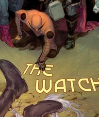
Marvel’s latest event comic, Original Sin, kicks off with a literal bang, as the Watcher’s home on the moon is destroyed and he is murdered by unknown assailants, who steal his eyes and a lot of his tech before absconding. After that, though, things kind of slow down a little bit and I think it’s definitely to the story’s benefit. Aaron very deliberately introduces the major players by expanding outward, opening with the likes of Nick Fury and Captain America before working through to second stringers like Ant-Man and Gamora. While we don’t get into the specifics of what these characters will be doing, the pairings are pretty fun, like watching Doctor Strange and Punisher play Good Cop/Bad Cop or seeing how much Ant-Man annoys Emma Frost.
Watching the heroes begin to follow leads and do forensic analysis of the Watcher’s murder sounds ridiculous, but Aaron’s dialogue and Martin’s muted colors help keep everything grounded. It actually kind of reminded me of the better parts of DC’s Identity Crisis event from 2004, without the misogyny or convolution. Deodato’s pacing is perfect, with a good split between tight close-ups and lavish half and full-page spreads for the bigger moments.
Speaking of, the standout section for me was right near the end, when a fight with a pretty classic Marvel creature hinted at the greater powers at work and how dangerous they’re going to be. I don’t want to spoil it, but it’s a really effective scene that sets up some interesting dynamics for the series. Events are kind of a hard-sell for me, but I’ll be following up next month for sure.
Written by Greg Rucka
Art by Russell Dauterman and Chris Sotomayor (colors)
Lettered by Joe Caramagna
Marvel
“Everyone stinks at being sixteen.”
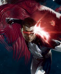
For whatever reason, Cyclops is kind of a polarizing figure in comics fandom. People complain about how boring and lame he is, probably because he doesn’t have knives that come out of his hands. He recently got something of an anti-hero makeover, which didn’t seem to solve anything. But I’d challenge anyone to dislike Cyclops #1, in which the younger, time-lost Cyclops hangs out with his space pirate father and his crew.
Dauterman’s art is a perfect fit for the crazy space adventures the series promises, with the Starjammers looking just the right level of stylized. The issue opens with an impressive visual recap followed by a gorgeous two-page spread and Dauterman’s sense of action keeps the events clear, even when they’re space battles.
Greg Rucka said that a lot of what drew him to the series was a chance to examine the relationship between fathers and sons and the book does a fantastic job in that respect. Rucka nails Cyclops’ inner monologue, evoking teenage feelings and insecurities in a way that’s both fun to read and a little painful, given how true it rings. Young Scott Summers isn’t quite the dour, by-the-book leader his future self became quite yet and he’s still nervous about his place in the world. He’s young enough that the revelation that his dad is still alive, and a pirate in space, is a source of pride and joy for him, rather than the usual X-Men angst.
His father, Corsair, is also in a unique position. The convoluted events of the Marvel Universe have given him a second chance to be a real father to his son, but they’ve also challenged him to fill a role he’s never had to before, and one he’s not sure he can handle. Corsair’s always been a little too comic booky for me, but Rucka does a great job of humanizing him. He has a sense of fun about him that can only help young Scott to become who Scott wants to be, instead of the adult Scott he’s met.
Even with the already amazing hook of “Kid Cyclops and his pirate dad in space, having adventures,” this book exceeded my expectations. It’s a rare treat to read a comic that connects so deeply with the universal experiences of growing up, especially in a first issue, but Cyclops #1 did and I’m glad.
Thanks for reading about what we’re reading! We’ll be back next week with a slew of suggestions from across the comics spectrum. In the meantime, what are you reading? Tell us in the comments section, on Twitter or on our Facebook Page!

