Deadshirt Is Reading… is a weekly feature in which Deadshirt’s staff, contributing writers, and friends-of-the-site offer their thoughts on a diverse array of comics, from name-brand cape titles to creator-owned books to webcomics.
Kayleigh Hearn is reading…
Written by Brian K. Vaughan
Art by Fiona Staples
Image
“She, uh, caught the space madness.”
Someday, in the not too distant future, a comics website will put together a list of “Saga’s Top 10 Opening Pages” and Issue #19’s surprising full-page spread will surely be included (under a censor bar, perhaps). Vaughan and Staples love to shake up and disorient their readers, and the prologue is preparation for the fourth story arc’s dramatic change in direction—as soon as you think you’re on stable ground, an earthquake hits.
Proud parents Alana and Marko, last seen fleeing their pursuers Gwendolyn and Prince Robot IV, have settled on the alien world of Gardenia. Their lives have jumped forward nearly two years, and they appear to be living happily in hiding: Alana supports their family by acting in superhero-themed soap operas known as “circuits,” Marko is a stay-at-home dad for toddler Hazel, and Marko’s mother Klara reads romance novels and looks after the new pet, a giant menstruating walrus. (Oh Saga, I missed you.) For now, Alana and Marko have escaped the war that threatens to destroy their cultures, but their marriage faces all new internal strife. During wartime, there’s no such thing as peace.
There’s a jolt of excitement whenever Saga returns from hiatus. Readers who expect space opera to only include spaceships and laser battles may be disappointed when the characters start arguing about bills, jobs, and taking the kid to the playground, but Vaughan and Staples are not interested in keeping their audience comfortable. Vaughan keeps exposition to a minimum, which can be disorienting in an issue suddenly populated by new characters and settings, but it’s a promising turning point in the series.
Fiona Staples’s art is full of treasures, like a beautiful baby mobile representing the galaxy’s planets, or instantly-memorable characters like Yuma, who appears to be a sentient being made of moss. I’m thrilled to have Saga back. Where else am I going to read about an alligator nurse delivering a robot baby?
Max Robinson is reading…
Written by Jason Aaron
Art by Mike Deodato (pencils) and Frank Martin (colors)
Lettered by VC’s Chris Eliopoulos
Marvel
“They’re quoting Gertrude Stein now. I’m not sure I can take much more of this.”
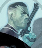
After two fairly disappointing issues (if we’re counting the only semi-related issue #0), Original Sin finally feels like it’s roarin’ and ready to go. With all his super-powered chess pieces in place, Aaron gives us a super weird, super exciting comic; Nick Fury fighting a crying Mindless One in the backseat of his flying Corvette and the triumphant return of two neglected Grant Morrison Marvel Boy elements is exactly the kind of rock-n-roll craziness a multi-part company crossover centered around Uatu the Watcher’s magic eyeball needs to have. Aaron peppers the issue with lots of nice little character interactions, the chief of them being the good cop/bad cop dynamic of Dr. Strange and The Punisher’s extra-dimensional crime scene investigation.
Deodato’s been a top-tier Marvel artist for a very long time and while I appreciate how he continues to grow as an artist (compare any of his recent work to say his 90’s run on Thor with Warren Ellis, it’s night and day), there’s a stiffness to his pencils that hampers storytelling and so far Original Sin hasn’t been an exception. His action scenes are competent, but everyone might as well be action figures for all the non-emoting they do. It would have been nice if Aaron had been paired with an artist who could do a little more with his wild ideas, like Marcos Martin or even Adam Kubert. As it is, Original Sin is shaping up into a fun ride that promises some real sharp right turns but one that could benefit from some better scenery.
Written by Christopher Hastings
Art by Jacopo Camagni (pencils) and Matt Milla (colors)
Lettered by VC’s Joe Sabino
Marvel
“I’m Spider-Man! I’m the mayor of rooftops!”
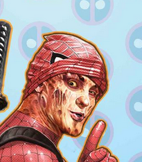
The inherent problem with Deadpool is that, under lesser writers, he can come off like a balding network executive’s idea of how a teenager would write Spider-Man. “He makes jokes but he shoots people in the head! He can heal like Wolverine! Give him a sword…no TWO swords.” But this week’s Deadpool annual from The Adventures of Dr. McNinja creator Christopher Hastings actually uses Deadpool’s derivative qualities as an asset, giving us a story where the Merc With A Mouth is forced to stand-in for a The Chameleon-targeted, sleep-deprived Spider-Man. These are both characters that require a writer with a pretty sharp sense of humor, and Hastings’ years of experience with the madcap absurdity and nonstop action of Dr. McNinja make for a natural fit here as Deadpool careens from one bad situation to another like a Power Wheels car driven by a drunk toddler.
While Hastings was the initial draw of this issue for me, I was really delighted by Jacopo Camagni’s gorgeous artwork throughout the issue. Aided by Matt Milla’s ultra-bright color pallette, Camagni’s pencils are super-fluid in a way that really benefits this kind of story. Small details, like the way Spider-Man’s mask bunches up in the back on Deadpool’s head or the way his giant white eyes move like liquid as he’s tossed around a rooftop are the kind of things that kept this from feeling like a rainy day filler comic kept in some Marvel editor’s backdrawer.
With this annual, Hastings and Camagni are able to spin gold from a pretty straightforward superhero team up premise and deliver a mostly self-contained done-in-one that’s a real hoot.
Jason Urbanciz is reading…
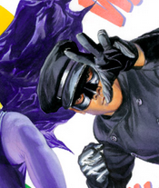 Batman ‘66 Meets The Green Hornet #1
Written by Kevin Smith and Ralph Garman
Art by Ty Templeton (pencils) and Tony Avina (colors)
Lettered by Wes Abbott
DC Comics
“I happen to think Batman’s cape is quite stylish.”
This comic is a pleasant surprise, owing mostly to the fact that Kevin Smith’s previous attempts at writing Batman have been, and this is being charitable, not good at all. It could be that having to stick to the 1960’s television series milieu makes it difficult for him to throw in references to Batman peeing his costume or how many times he’s had sex in a single night, so he’s gotta stick with the cleaner jokes.
Bruce Wayne is safeguarding a shipment of valuable artifacts as it makes it way via train to the Unnamed City of The Green Hornet, where he meets his old school chum Britt Reed and his valet Kato. Soon enough, they are called upon to guard the shipment from pink-clad thugs. While the story zips along really well, it may zip a little too fast. I realize that they only have half a normal issue’s real estate to tell their story, but this very much feels like half a comic. Usually, Batman ‘66 is able to deliver a more complete story in its short running time. I just hope when the next installment hits it retroactively makes this comic feel more complete rather than compounding the problem.
While the writing is good, if incomplete, the art is fantastic. Ty Templeton has long been a favorite of mine. His crisp, clear art wouldn’t be out of place in a DC comic actually published in the year 1966. He does a great job of matching the various characters with their 60’s actors (I’m unsure if they had rights to Van Johnson and Bruce Lee, but they certainly look close enough). My only hope is that going forward, the writing allows Templeton to show more dynamism in his art, because this issue featured a lot of conversation.
I was initially dreading this crossover (since it’s taking the place of the normal Batman ‘66 series for the next few months), but after this first issue I feel a lot better. Though not on par with the main series’ best stuff, Batman ’66 Meets The Green Hornet has a similar quality to it, and I look forward to it picking up as it goes along.
Dominic Griffin is reading…
Written by Mark Millar
Art by Duncan Fegredo
Colors by Pete Doherty
Image
“I know babe, but we need to stay positive…”
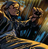
My Mark Millar-related scorn is well documented, as I fall very much on the Grant Morrison side of things ever since the Great ScotBro Comic Break-up of the early 2000s, but I still regularly check in on Millar’s creator-owned work. I do this partly out of morbid curiosity but partly because he always nabs some of the best artists in the biz for his projects. MPH, a “real world” take on the power of super speed, fits the Millarworld mold of high concept, simple premise genre storytelling tailor-made for easy consumption and motion picture option potential. What I really dig about it is its boundless sense of optimism against a moldy, brown and grey urban depression.
MPH is the story of Roscoe Rodriguez, a surprisingly sunny drug dealer with big dreams, who gets framed by his boss and ends up in jail, where he pops a pill that essentially makes him into The Flash. On the surface, it is EXACTLY how you would imagine Millar tackling this story, but something about the way Fegredo’s gritty pencils capture the economically devastated Detroit, or the fact that our protagonist is a small time hood who reads The Secret and has a vision board in his prison cell. The characters are still broadly, awkwardly drawn, and his dialogue is still a clumsy mess, but here, Millar has crafted himself the beginnings of an enjoyable little parable, and I’m, oddly, excited to see where he takes it.
Thanks for reading about what we’re reading! We’ll be back next week with a slew of suggestions from across the comics spectrum. In the meantime, what are you reading? Tell us in the comments section, on Twitter or on our Facebook Page!


One thought on “Deadshirt Is Reading…Big Gooey Eyeballs and Pleasant Surprises”
Comments are closed.