Deadshirt Is Reading… is a weekly feature in which Deadshirt’s staff, contributing writers, and friends-of-the-site offer their thoughts on a diverse array of comics, from name-brand cape titles to creator-owned books to webcomics.
Joe Stando is reading…
 Original Sins #1 (of 5)
“Terminus” – Written by Nathan Edmonson, art by Mike Perkins
colors by Andy Troy, and letters by Clayton Cowles
“Hidden in Plain Sight” – Written by Ryan North, art by Ramon Villalobos
colors by Jordan Gibson, and letters by Clayton Cowles
“Lockjaw: Buried Memory” Written by Stuart Moore, art by Rick Geary,
colors by Ive Svorcina, and letters by Clayton Cowles
Marvel
“Your mission went bad, but you… You were better. You are always better.”
Editor’s Note: You’re not crazy. Original Sin, the core title for Marvel’s crossover event, has been going on for months now. This is Original Sins, with an “s,” a separate but related title. Carry on. -DR
Original Sins is a big crossover event that allows for a Big Two publisher to indulge in a rare beast: an anthology book. It’s a chance to provide a snapshot of various characters and circumstances across the universe, focusing on lesser known or up-and-coming characters. It’s also a chance to showcase new talent for a company, with diverse styles of art and storytelling. In short, I love them.
The first story, “Terminus,” reminds me a lot of DC’s Brave New World one-shot anthology that came out just after Infinite Crisis. It uses the events of Original Sin #2-3 to tease a new take on Deathlok, one that’s both intriguing and dangerous. It’s another example of why I love the ongoing OS event so much, in that it allows for setting up and accelerating plots without requiring the reader to follow every issue and tie-in. Perkins’ art is suitably violent for the story of this cyborg assassin, and I found it interesting that his new, slimmed-down design looked quite about like the take from Agents of S.H.I.E.L.D. It’s only a couple of pages so there’s not much story, but we already get a sense of the depth and potential tragedy of this new Deathlok.
The second feature, “Young Avengers: In Plain Sight,” is a multi-part story that will be serialized throughout the book, and one that presents a pretty interesting slate of talent. It’s written by Ryan North, known mainly for the webcomic Dinosaur Comics and the Adventure Time ongoing series, and drawn by cult superstar Ramon Villalobos. It might sound like an odd combo, but it comes together for a vibe that echoes the Gillen/McKelvie run of Young Avengers while still being thoroughly its own beast. North brings some tricks of the trade that suit this team of teens perfectly, like alt text-style asides half-hidden at the bottom of the page and clever parodies and references to websites and social media. Villalobos draws the best shoes in the business, and each character’s sense of style shows through clearly (also due in no small part to the bold palette Gibson uses to introduce them). Teddy’s transformation into Hulkling is one of my favorite subtle hulk-outs I’ve seen. My hope is that we see Kate Bishop sooner rather than later in this yarn, but it’s a solid anchor to the miniseries.
Finally, “Lockjaw: Buried Memory,” is a two-page gag story that takes the Inhumans’ loyal mutt on a tour of the Marvel Universe. It’s extremely cute, and a fun showcase of characters old and new as Lockjaw looks for someone to help him act on a shocking new memory. I love gag strips, and anthologies provide a great home for them. I hope we see more of these in the coming issues, as well.
Max Robinson is reading…
 She-Hulk #5
Written by Charles Soule
Art by Ron Wimberley
Colors by Rico Renzi
Lettered by VC’s Clayton Cowles
Marvel
“Yep. Thors. Trust me, they’re all Thors.”
She-Hulk has spent the last four issues quietly building up the mystery behind “The Blue File,” an old court document that details a lawsuit that by all accounts shouldn’t exist against her, Wyatt Wingfoot, Tigra, The Shocker, and other super-powered individuals. With issue five, Soule and company kick off an arc called “Blue” that finds She-Hulk, on-retainer investigator Patsy “Hellcat” Walker, and paralegal Angie Huang searching for answers on their own and finding only danger. She-Hulk has been a consistently outstanding title since it launched, but with this issue Soule kicks over a number of carefully placed dominos and leaves us with not one but THREE cliffhangers. This is an ingeniously plotted issue and each segment’s slow descent into out-of-nowhere mayhem and bloodshed is legitimately shocking after four issues of fairly breezy “superhero book without superheroics” stories.
Artist Ron Wimberley (Prophet, Prince of Cats) relieves Javier Pulido on art duties for this two-parter, and his work here is, well, frustrating. The elasticity of Wimberley’s art makes for some incredibly dynamic sequences. Hellcat’s knock down, drag out fight with Tigra is straight up gruesome. While I appreciate the rough aesthetic of Wimberley’s pencils (especially in that it continues the book’s philosophical pushback against cheesecake), it feels like an odd fit on She-Hulk given Pulido’s immaculately polished final product in previous issues. It’s not bad, it’s just jarring and not entirely up to the high standards of Marvel’s other recent forays into less conventional comic art. That said, it’s still head and shoulders above, say, Greg Land’s sleepwalked art that mars this week’s otherwise delightful Mighty Avengers, and it’s refreshing that a Big Two company like Marvel is willing to take risks like this.
Kayleigh Hearn is reading…
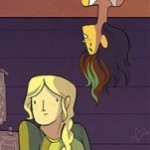
Lumberjanes #3
Written by Noelle Stevenson & Grace Ellis
Art by Brooke Allen
BOOM! Studios
“I WILL SNAP YOUR TWIG ARMS LIKE TWIGS FOR YOUR ARROGANCE.”
Lumberjanes’ third issue marches forward like the next chapter of a pulp adventure serial, taking us deeper—literally—into the mysteries surrounding the girls’ summer camp. Jo, April, Ripley, Mal, and Molly struggle to find their way out of an underground labyrinth full of mysterious crystals, deadly traps, and talking Greco-Roman statues straight out of a Ray Harryhausen film. Each girl has a special skill that helps them survive the obstacles in their way, like April’s arm wrestling or Ripley’s fastball special (don’t tell Wolverine). But will their skills be enough to save them? And what does this have to with the ‘Holy Kitten’?
The plot itself is, honestly, unspectacular. The Lumberjanes travel from points A to Z in a formation recognizable to anyone familiar with video games or The Goonies. In spite of this, Lumberjanes feels new, mainly because of the strength of its cast. Brooke Allen’s artwork is charming and distinct, and the teenage girls actually look and dress like teenage girls, which is sadly a rarity in comics in 2014. We learn more about who the girls are and how the group relates to each other, and their personalities are thankfully more than one-hit wonders (“the smart girl,” “the tomboy,” etc). The Lumberjanes are protagonists in a genre that often sidelines or excludes women entirely, and it’s refreshing to read an adventure series starring a group of fun and intrepid girls.
There’s nothing revolutionary in how the adventure resolves (Will the one girl who feels left out of the group discover her hidden skill in time to save the day? What do you think?), but it feels comfortingly warm and familiar, like the comic book equivalent of a cup of hot chocolate. With the recent news that Lumberjanes has been upgraded to an ongoing series, I’m even more intrigued by the story’s possibilities and just where Stevenson and Ellis are taking the characters. The Lumberjanes are going to have the most intense “What I did on my summer vacation” essays ever.
Patrick Stinson is reading…
 The Transformers: Robots in Disguise #30
Written by John Barber
Art by Andrew Griffith, Casey Coller, and Brendan Cahill
Colors by Josh Perez and Joana LaFuente
Lettered by Tom D. Long
IDW
“Do not strain your vocabulary, Galvatron.”
The soft relaunch of Robots in Disguise with issue #28 brought some of the most well-known Autobots and Decepticons to Earth for the first time in years. However, the first few issues seemed to prove the old adage that, ever since the Marvel days, no one can do good writing for humans and good writing for Transformers in the same story.
The human characters and storylines remain bland, which is a shame considering that the story potential of the post-apocalyptic IDW-Earth has yet to be exploited. As usual, though, the Autobots and Decepticons make up for it with aplomb. The Decepticons are co-led by Galvatron–an ancient warrior-king hoping to re-live his glory days by squishing Earthlings–and Soundwave, who since Megatron’s defection has become a sort of radical idealist who seems sincere in his desire to form a productive alliance with Earth. The Autobots are riven by new mistrust between Optimus Prime and the sneaky second-in-command Prowl, who applies his usual style of ruthless manipulation to all three sides. These two conflicts are forming the backbone of the series.
This is a more entertaining issue than the two previous, as story threads start to pay off, and Barber’s trademark Machiavellian characters make their moves. The human-Decepticon alliance still doesn’t feel believable, but is given important context by revealing that the humans have a weapon that can shut down their “allies.” Moreover, the human faction reveals itself to be more than just a traumatized junior partner, as we discover that they are imprisoning Alpha Trion, the Autobot sage who both Transformer factions seek.
This is the least flashy and most traditional Transformers book on the stands right now, but it is still recommended. It maintains the strongest thematic links to the upcoming Age of Extinction movie, which also revolves around humans hunting down Transformers on Earth, and so it might be of special interest to Transformers fans who are new to these comics.
Cameron DeOrdio is reading…
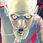 The Empty Man #1
Written by Cullen Bunn
Art by Vanesa R. Del Ray
Colors by Michael Garland
Lettered by Ed Dukeshire
BOOM! Studios
“I … I can’t get it out! Can’t get it OUT!” – Josh, tearing at his own face
The Empty Man is a new six-issue horror series focused on the fictitious disease, cultural phenomenon, and deity of the same name. While much remains shrouded in mystery, due in large part to conflicting reports as to the facts around The Empty Man, it would seem to be some sort of tulpa-virus that targets those who fear catching it.
In the issue’s several individual plots, the pacing of information is well handled. However, it feels at times like too many threads are introduced in rapid succession, preventing any of them from getting the space their interesting concepts deserve and crowding out characterization in the process. The Empty Man #1 is very aware that it is a first issue, to its credit and its detriment.
A first issue should establish what a book is about, but it doesn’t have to set up every single arc in the series. To the former point, though, the creative team does a fantastic job. This book wants to be sinister, disorienting, and occasionally flat-out disturbing. I mean, one Empty Man-afflicted woman feeds her newborn to dogs because she’s convinced it begged her to kill it.
Del Ray’s rough-hewn art and Garland’s muddy tones are perfectly suited to this dark, murky story, one whose conceit feels fresh and interesting, even with familiar notes of Lovecraft and Slender Man. Bunn et al. have placed before us a sprawling set of mysteries and terrors. I just hope six issues is enough to unpack it all.
Jason Urbanciz is reading…
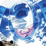 Infinity Man and the Forever People #1
Story and art by Keith Giffen and Dan DiDio
Inks by Scott Koblish
Colors by Hi-Fi
Letters by Travis Latham
DC Comics
“If this is your first boom tube, I suggest being careful. The ride can be quite dramatic.”
I wanted to love this comic so much. I’ve made no secret of the fact that I think that Dan Didio and Keith Giffen’s OMAC is the best comic to come out of DC’s New 52 line-wide reboot, and that it only got eight issues was a darn shame, though it was a miracle it got created at all. That the same creative team was coming back to revive another Jack Kirby property was the biggest comics announcement of the year for me. The comic has turned out to be pretty good, which after building it up in my mind so much is a disappointment. While OMAC jammed so much into each issue that they felt like a throwback to the days when comics cost a quarter and entertained you for a solid thirty minutes, this feels like a much more 21st century first issue, meant to be read in five minutes and to do little more than set up the next issue. It’s good comics, just not stunningly so.
Bored of their life of luxury on New Genesis, a group of juvenile New Gods gather to take a boom tube to Earth for unexplained purposes. Upon their arrival on Earth, they get an info dump of what to expect on our planet and we move on to the issue’s b-plot. There, two scientists are pursued by unseen monsters on a farm. Though short, this sequence had the most life, its breakneck pace appreciated after so many pages of exposition. Still, I liked this issue, it was just unfortunately conventional.
Giffen’s Kirby-inspired art is always welcome, especially when working on Kirby’s own concepts. The colors are bright, in pallets of greens, oranges, and purples, and it’s a nice respite from the dull primary colors of most comics. I’m really disappointed to learn that Giffen will be taking the next few issues off, probably due to his chores on DC’s weekly book Futures End. Still, Tom Grummet and Jim Starlin aren’t bad fill-ins, and I like this book enough to stick with it for at least a few more issues to see if it moves past its conventional first issue.
 Angry Birds Comics #1
Written by Jeff Parker and Paul Tobin
Art by Paco Rodriguez, Marco Gervasio, and Cesar Ferioli
Colors by Julie Gore, David Garcia Cruz. and Digikor Studios
Letters by Rovio Comics and Pisara Oy
IDW Comics
“I don’t get it…how does he blow up…but he don’t blow up?”
We’ve all played Angry Birds. Hell, my mom has played Angry Birds. It’s darn near universally enjoyed, but I can’t imagine anyone is there for the deep backstory. For that reason, I thought basing comics (and, apparently, an upcoming movie) around the property was an iffy proposition. Fortunately, they stick to quick, 6 8 page stories, largely centered around a simple gag, and they got writers who are really good at those stories. I’ve long been a fan of both Jeff Parker and Paul Tobin from their days of writing Marvel’s all-ages Adventures line, and they bring their talents for fun, quick stories to bear on this book. Each of the stories centers around an fun premise (bomb bird has the hiccups, the pigs are trying to build a new house, the pigs are spreading anti-bird propaganda) and give you a few laughs before moving on to the next story.
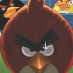
As with most licensed comics of this kind, the art doesn’t have a lot of room for style, but it’s clear and bright and does well conveying the birds’ and pigs’ emotions even though they don’t have much to work with. (They’re all just floating heads, basically.)
While I liked the issue, it’s probably not something I’d seek out monthly, though I’m not the target audience for it. I read this with both my sons (ages 8 & 11) last night before bed, and they liked it a lot. They’ve played the games, and the comics are a good slapstick companion for when it’s time for them to put down their tablets and do some reading.
Thanks for reading about what we’re reading! We’ll be back next week with a slew of suggestions from across the comics spectrum. In the meantime, what are you reading? Tell us in the comments section, on Twitter or on our Facebook Page!

