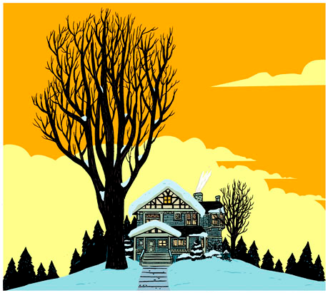
Since breaking into the comics scene with 2007’s Annihilation: Conquest – Starlord mini-series, colorist Nathan Fairbairn has worked as something of a silent partner with artists such as Chris Burnham on Batman Incorporated and Yanick Paquette on Swamp Thing (to say nothing of a host of upcoming Grant Morrison-written projects that include Nameless, The Multiversity and Wonder Woman: The Trial of Diana Prince). Most recently, he has been Bryan Lee O’Malley’s exclusive colorist, providing the hues for Oni’s reissued Scott Pilgrim editions as well as O’Malley’s latest original graphic novel, Seconds. This week, Deadshirt talked to Fairbairn in a phone interview to discuss his career, the process of collaboration and his future aspirations.
[Editor’s Note: Small portions of the text of this interview, denoted with an asterisk, were altered at 1 pm eastern on July 16th at the subject’s request]
Max Robinson: Can you tell me a bit about your working relationship with Bryan Lee O’Malley? How did that come about?
Nathan Fairbairn: Oni and Bryan were looking for a colorist for the Scott Pilgrim series, and they asked I think five or six colorists to try out for the book like a year before the movie came out. The movie came out and I just kinda assumed they’d decided not to color it. Then a year after that they offered me another tryout, so I did like five pages in a day and sent it off. And apparently that worked in my favor because they didn’t want a guy who was slow [laughs]. So Bryan saw it, and he liked that I basically did what he wanted without him having to tell me.
The way it works with Bryan is they send me all the pages for a given Scott Pilgrim volume and I just have at it. At first I would turn in batches every forty pages or so, but the last book I think I just sent him the whole 170 pages all at once. Then he goes through it, sends me all his notes. It’s pretty streamlined now.
So I think I’d just finished Volume Four and I knew that he was working on Seconds, and that it was going to be a black and white book or a one tone kind of thing. But he was so happy with how the colors had turned out on Scott Pilgrim that he asked me to come aboard and color Seconds.
 MR: How would you say his creative decisions as the writer-artist of Seconds inform your color choices?
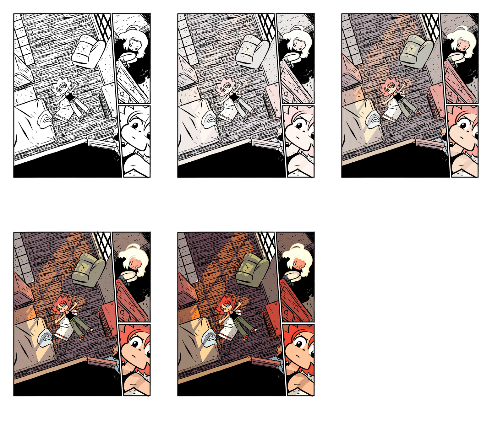
NF: They do, to a certain extent. It’s interesting because Bryan has extremely specific ideas for the colors of things? Like if there’s a scarf, he knows that scarf is teal or 80% cyan but he doesn’t really give a lot of direction for the color of a scene. Although sometimes he will say “Yeahhh I was thinking it’d be more __” after I’ve finished a scene. Like “Oh? Okay. It’s blue!” [laughs]. But on Seconds that kind of stuff happened really infrequently.
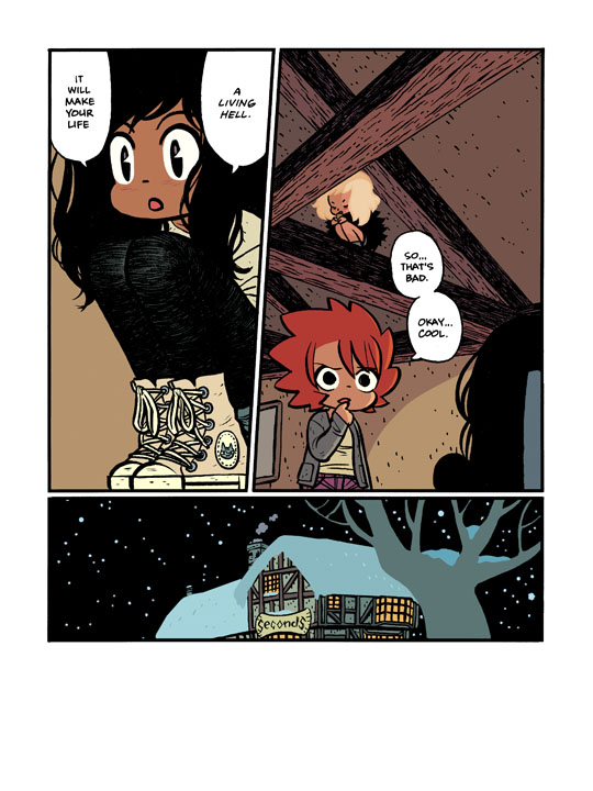
He had some general notes on how, say, the kitchen area [of the “Seconds” restaurant] should be really dark and oppressive and so that informed my color choices. He had initially produced a rough manuscript in spot color, like a orangey-reddish monotone, so he had a hard time not seeing everything in that color. So he’d suggest things like “oh that snow should be pink” that I hadn’t really considered but that ultimately made the book better off. Like, I was really happy with the last scene, which came together two weeks before the final deadline. Bryan had this epiphany and completely changed the last twenty pages, and I colored it in a couple days but I did my own thing on it and he loved it. So that was amazing, having this sudden change at the end of 300 pages of work, because it injected so much energy and spontaneity into the finished book.
MR: I’ve only had Seconds in hand for maybe an hour but it’s a really gorgeous book. How do you feel about the end product?
NF: I’m very proud of it. I’m even happy with the printing — which I never like. They sent me a copy in print two or three months ago and it was my first time seeing it and, no matter how good the printing is, the colors are never going to match how good they looked on a glowing monitor. So I was at first like “Ehhh it’s not very good” and my wife said “Oh you say that every time.” And she was right — it just took me a little time to see that the printing was actually pretty great.*
MR: It’s funny that you say that, I’ve heard color used as a major selling point for digital comics off a platform like Comixology versus print comics.
NF: Absolutely, I mean there’s an entire gamut of colors you can’t use in [the color mode] CMYK like, say, neons. At Marvel I colored a great deal of their cosmic titles and there’s all these amazing power special effects. Everything’s glowing and hot, right? So I felt frustrated by the print limitations on color that existed in 2007 and I was prepared for Marvel and DC to start asking colorists to turn in a RGB file in addition to a CMYK file, to take advantage of the fact that there’s so much more color space available digitally. But that never happened and probably would’ve required a conversation about compensation since there’d be so much recoloring.*
But that’s actually something that I am trying to do on Nameless with Grant Morrison and Chris Burnham, which we’re putting out through Image. And I’m coloring the book basically twice so that I can punch up some of the really trippy scenes with illegal colors, colors that wouldn’t actually print.
MR: “Illegal colors.”
NF: Yeah, that’s actually what they’re called, if it goes out of gamut. I’ve seen young colorists who don’t understand this concept and will show off a really cool green that’ll look like a shitty yellow in print [laughs]. I learned so much of my craft from guys who’d been doing it for ten years like Matt Hollingsworth, guys who have done physical colors guides. So while I work entirely digitally, I at least had a grounding in the actual manufacturing.
A lot of people who come along now don’t think that matters and honestly more and more it really doesn’t since the programs are so smart and the printers are getting so good. As with anything, you need to know your tools but the less you need to worry about stuff like that, the more you can scrape out the actual art.
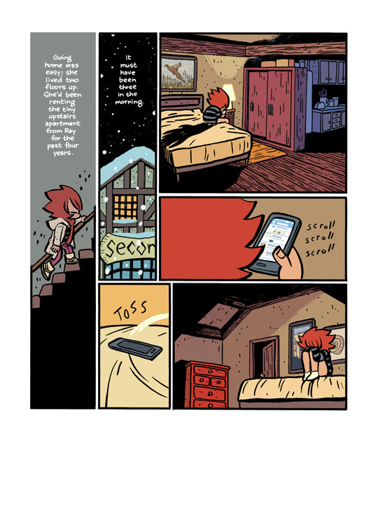 MR: Doubling back a bit to Seconds, it’s interesting to see this red/brown/blue color scheme all over the book compared to say Scott Pilgrim which has some greys and navy blues but is also heavy on hot pinks and really bright blues. When you go into these projects, how much of a plan do you have in your head already?
NF: When I got started on the book I sat down and made a palette inspired by Beauté, which is this French comic book that Bryan is obsessed with. So I got a copy of this book and I studied it and I poured through it. It’s always a challenge when an artist hands you another book and says “hey can you do this?” because to a certain extent you can, but so many of the color choices are really determined by the line art. The art in Beauté is softer than Bryan’s and I wanted to do something more saturated than the gentle pastels there. I went with a completely flat, matte approach on Seconds, there’s no rendering on the figures and pretty minimal airbrushing. Those things are almost like a crutch, right? If you’re making the right choices with your palette, you have to work less with the rendering and the modeling and the lighting and stuff like that.
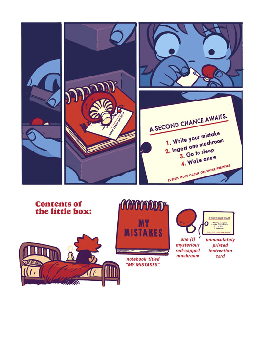 So I went through the book and picked colors that I thought would work with Bryan’s art and that’s how I made my pallette. And I stuck to it for almost twenty pages before I just stopped consciously thinking about it. I’ve colored over 4,000 pages of comic books, and a lot of it is reverting back to colors that you know and like, ones that work. You sorta become blind to it [laughs]. So you go in with all these ideas and outlines and plans but then suddenly the deadline shows up and every thought but “get it done” goes out of your head. So I used that palette to set key colors, “this scene is pink, this scene is blue” and went from that.
MR: Color is so important when you look at a single comic or a graphic novel and it’s weird that, speaking for myself as a reviewer, people often don’t really appreciate it or know how to talk about it? It’s sort of a thankless gig, it’s so often glossed over when we talk about comics. What keeps you coming back to this kind of work?
NF: I really like the partnership that you develop with an artist, I’ve never really needed to be the guy in the spotlight. I played bass in the bands I’ve been in, you know? [laughs] I don’t really care about getting any credit, I just want to work with passionate, talented people to create something good. And, I mean, I’ve got greater aspirations in terms of comics, I want to be a writer. I wrote a Batman story [Editor’s note: The story, “Brave”, was included in last year’s Batman Incorporated Special and featured art by John Paul Leon.] and I just pitched a six issue mini-series to Oni that they picked up and we have an artist on, so that’s really exciting. I’ll be coloring that as well.*
 Seconds is available now from Random House.

