Deadshirt Is Reading… is a weekly feature in which Deadshirt’s staff, contributing writers, and friends-of-the-site offer their thoughts on Big Two cape titles, creator-owned books, webcomics and more. For more of our thoughts on this week’s new comics, take a look at Wednesday’s Deadshirt Comics Shopping List.
Dominic Griffin is reading…
Written by Warren Ellis
Art by Tula Lotay
Letters by Richard Starkings
Design by John Roshell
Image
“Don’t trust Darius Dax.”
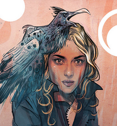
Ellis follows writers like Joe Keatinge and Brandon Graham in the “reboot old Rob Liefeld creations” trend this week with his and Tula Lotay’s new Supreme series. Taking a drastic departure from the considerable work Alan Moore did on the character in the late 90s, Ellis turns the usual Superman pastiche into a sternly modern sci-fi mystery centered around Lois Lane clone Diane Dane, who Ellis imbues with a fierce, likable personality that instantly allows us to forgive the title character’s overt absence. Add to that a race-bended Darius Dax, some dreamlike visuals, and a pervasive sense of cosmic doom and you’ve got a fascinating genre experiment at work.
The real star here is Lotay, whose work is reminiscent of Tommy Lee Edwards’ on The Question, but with smooth facial acting and a slicker design sense. The character designs are in the same wheelhouse as McKelvie’s in The Wicked and The Divine, streamlining recognizable elements from the mythology into real world fashions without hiding from what came before. For a first issue, the new tone is well set, but one can hope future installments don’t veer too far from the general Supreme concept, otherwise what is gained from associating with that title in the first place?
Max Robinson is reading…
 100th Anniversary: The Avengers #1 (one shot)
by James Stokoe
Marvel
“I fear we will only ever be guests here. The world will always change while we stay the same.”
It’s unlikely that we’ll ever see James Stokoe ever helm a run of The Avengers month to month over at Marvel. But thanks to their very tongue-in-cheek “100th Anniversary” celebration, we get a nice glimpse at what that would look like. The conceit of the 100th Anniversary one-shots, purporting to show readers what an average Marvel title would look like in the year 2063, is pretty clever. If Peter Parker hasn’t aged much since the 70s, what would Marvel’s entire superhero landscape look like after 100 years of floating timelines, deaths and rebirths?
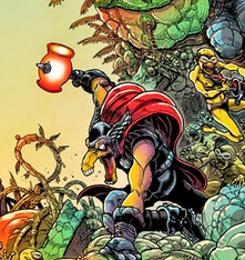
Stokoe picks up this ball and runs with it in 100th Anniversary: The Avengers, throwing us into the aftermath of an epic Avengers story that…doesn’t actually exist. Following a war with the Badoon empire that left America teleported into the Negative Zone, a ragtag group of Avengers (including an immortal Rogue, a reincarnated Dr. Strange, Tony Stark’s brain in a jar and, of course, Beta Ray Bill) find themselves fighting the subterranean forces of a classic Fantastic Four foe.
As always, Stokoe’s art here is gorgeous. Saying a Stokoe landscape looks good is like saying water is wet–at this point it feels redundant. And while Stokoe’s environments continue to impress, his character redesigns for Dr. Strange and Iron Man (reimagined as a massive robotic Malaysian skyscraper) are also excellent. But Stokoe’s writing is the real strength of this issue and it occupies a couple of interesting levels. Stokoe really embraces the idea behind 100th Anniversary, even greeting us with an opening page with laugh out loud advertising (I can’t wait to get the Werewolf By Night gene graft for my Quiblet!) and editorial notes (including a death notice for “comics veteran” James Stokoe). The story itself, while operating under the pretense of being a regular issue of The Avengers from 2063, is really an excuse for Stokoe to pontificate a bit on the semi-permanent status quo nature of corporate-owned superhero comics. While this never scratches too far below the surface in that regard, Stokoe’s plot resolves itself–and this line of thought–nicely by the end of the issue (while teasing us with an awesome Captain America story we will, sadly, never get to see). Stokoe’s vision of the Marvel Universe as it exists 49 years from now seems like a pretty cool place, and I hope we get to come back and visit some time.
Jason Urbanciz is reading…
Story by Sergio Aragones and Mark Evanier
Art by Sergio Aragones and Thomas Yeates
Colored by Tom Luth
Lettered by Richard Starkings and Comicraft
Dark Horse
“But have Groo meet Conan? Somehow not seem realistic!”
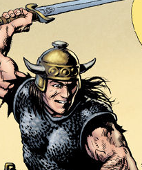
Crossovers seem to be the rage again in comics these days, so it makes sense for Dark Horse to face off their two most well known sword-wielding barbarians, Conan and Groo. Fittingly, the book is an odd one, starting off as a pretty standard Conan tale (with beautiful Hal Foster-inspired art by Thomas Yeates) and getting meta-textual from there, with co-writer Sergio Aragones taking over the art and depicting himself defending a comic shop from an encroaching developer, getting knocked on the head and then placing himself, as Groo, back into Conan’s story. It’s a weird book, but it’s funny and while the two art styles clash, they work well to meld the worlds of Conan and Groo (and our own).
While the book is split amongst three (wildly) different story threads, it never feels like it is rushing. This is one of the best paced books I’ve read in a long time, I was shocked that it stuffed so much into its 23 pages. It helps that the majority of the dialog is in the fourth wall breaking segment between co-writers Aragones and Mark Evanier who banter like they’ve been at this for years (and they have). Aragones and Yeates’ conflicting art styles really make this comic, vividly showing two clashing worlds coming together, showing some events and setting from different points of view in each’s different style.
This comic was a lot of fun, Aragones and Evanier’s writing seems really inspired, and I’m looking forward to seeing where it goes next.
Jen Overstreet is reading…
 Hana Doki Kira (graphic novel anthology)
Year 85 Group
Freshly shipped to its Kickstarter backers, Hana Doki Kira is a collection of comics and illustration inspired by shōjo, the sub-genre of Japanese animation and manga targeted at women. The cover is beautiful in minimal teal with the pictograph title in gold foil, and the print quality throughout the book is excellent, with artists given the option between greyscale, teal scale, or both.
As an explicitly manga-inspired book, Hana Doki Kira is an interesting study in the wide-ranging influence of manga style and writing on western comics. Some of the Hana Doki Kira artists are working within an anime style, but the book also shows a glimpse of other shōjo manga elements that have had a big influence on today’s indie and indie-inspired comics–floating panel structures, visual effects like sparkles and flowers, and writing focused on an internal, first-person narrative.
Favorite moments include Carey Pietsch’s sweet comic about an animal familiar passing on from her group of magical girl trainees, complete with a cast of magical girls that look like me and my shōjo nerd friends actually did in high school; Aimee Fleck’s narrative sequence of illustrations scattered throughout the book with Greco-Roman styled magical girl uniforms; and Kris Mukai’s swoopy brushwork and NY-Times-illustration-meets-Sailor-Moon-figures in the darkly humorous “Spotlight.”
Thanks for reading about what we’re reading! We’ll be back next week with a slew of suggestions from across the comics spectrum. In the meantime, what are you reading? Tell us in the comments section, on Twitter or on our Facebook Page!


