Deadshirt Is Reading… is a weekly feature in which Deadshirt’s staff, contributing writers, and friends-of-the-site offer their thoughts on Big Two cape titles, creator-owned books, webcomics and more. For more of our thoughts on this week’s new comics, take a look at Wednesday’s Deadshirt Comics Shopping List.
Patrick Stinson is reading…
Written by Mike Johnson, story consultant Roberto Orci
Art by Tony Shasteen
Lettered by Neil Uyetake
IDW Publishing
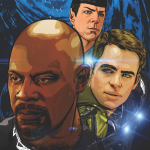
“You must be James Tiberius Kirk. My name is Gul Dukat. Welcome to Terok Nor.”
My opinion on writers Mike Johnson and Roberto Orci is aggressively uneven. The rebooted Star Trek movies co-written by Orci are very solid films in concept, but in execution they have unsatisfying plots and assume a pathos not wholly earned. Further, they minimize the exploration and philosophical elements of the Trek franchise.
Star Trek, of course, has always been extended productively by novels and comics because it is an inherently episodic franchise. Unconstrained by budget, printed tie-ins are free to create astonishing vistas while extending the legends of the ongoing regular characters. But from its inception, the new Trek film franchise has creatively leaned on the IDW comic tie-ins to an unusual degree. This is definitely a flaw in the films themselves, which can’t be bothered to actually include the elaborate backstories for their villains that were supposed to make them intriguing and threatening in the first place. However, many of the comics themselves have been quite interesting, and more respectful of the existing Trek universe than Abrams’ own rebooted style and design has been. I haven’t always enjoyed Johnson’s own work for IDW, but Star Trek is him in his element, and his close professional relationship with Orci has helped the comics and the screenplays synchronize in a way not seen with any other film tie-in comic that I’m aware of.
I went into this issue cautiously, given my complex brew of opinions about the reboot in general and having found the comic series’ earlier gender-swap universe-hopping storyline merely adequate. I came out of it convinced that Johnson and Orci have conceived a brilliantly clever and deliciously fun story that embraces all eras and elements of Star Trek: not to mention blown away by Shasteen’s amazing likenesses of both actors and starships.
The cosmic trickster Q (a franchise staple from 1987-2000 or so, if you are young, think Discord from My Little Pony) warps the Enterprise through space and time to Deep Space 9…or rather, the rebooted timeline’s version of Deep Space 9. Kirk, who’s been beaten up by everyone else, gets to be beaten up by some Jem’Hadar troopers and fussed over by the best Trek villain ever, Dukat, who’s tickled by the random appearance of a museum piece from the now-defunct Federation. Unfortunately for him, Captain Ben Sisko is now the head of what’s left of the Federation and manages to rescue part of the Enterprise command crew. In a nice touch, Kirk refuses to leave the rest of his crew. In a nicer touch, Sisko coldcocks him and beams his ass out of there.
One of the many levels on which this story works is that it parallels one of Next Generation’s best episodes, “Q Who.” Just as in that story, Q takes offense at the captain’s arrogance and transports him to an early confrontation with a great enemy–in TNG it was the Borg, here it’s DS9’s ultimate villain the Dominion. Q is revealed to be more than just an illusionist by the death of crew members and lasting consequences. At the end of “Q Who,” Q was mollified and rescued the Enterprise, but the fallout spilled into the entire rest of the franchise as the Borg ever after sought to subjugate the Federation. Perhaps that’s an indication that the rest of this six-parter will similarly bring a major change. At any rate, this Enterprise’s wild ride is just the beginning, as the final panel smashes together two long-time Trek symbols in a disturbing and fascinating way! Definitely signed up for the rest of this story arc, and any Star Trek fan should consider “The Q Gambit.”
Kayleigh Hearn is reading…
Written by Marc Guggenheim
Art by Dexter Soy
Marvel Comics
“Thank you, Psylocke. I’ve never had the opportunity to fight a rogue bioweapon before.”
I’m giving X-Men a second chance.
X-Men was one of my most anticipated books of 2013. Released with much hype and controversy, X-Men starred an all-female cast of superheroes, including Storm, Kitty Pryde, Rogue, and Jubilee, and started conversations about women in comics—conversations made even more complicated when original writer Brian Wood was accused of sexual harassment. I dropped X-Men after issue #7; even without the dark cloud the allegations cast over what was supposedly a feminist book, the series was a disappointment. The writing was mediocre, it lacked a consistent artistic team, and Kitty and Rogue were shuffled off to other books. I was eager to give X-Men’s new creative team of Marc Guggenheim and Dexter Soy a chance.
I want X-Men to be good, and I want it to be a success—it has a fantastic cast of characters, and Guggenheim does pretty right by them in his first issue. It’s a solid beginning to a space adventure, as Storm’s X-Men are summoned by Agent Brand to investigate the return of their old enemy Deathbird. (Who, Guggenheim reminds us, is Rachel Grey’s aunt-by-marriage. The Summers family tree, amirite, X-Men fans?!) The storyline moves briskly towards its cliffhanger ending, arranging the stage for new developments while building on the X-Men’s previous encounters with alien enemies. Guggenheim also shows that it’s absolutely not a stretch or a gimmick to populate the book with a female main and supporting cast—Storm, Rachel, Deathbird, and Brand (just to name a few), are all powerful, well-developed characters worthy of the spotlight.
I was initially underwhelmed by Dexter Soy’s art, but he pulls the issue together with a beautiful and elaborate splash page of the X-Men’s telepaths linking minds with Deathbird. He’s capable of rendering the book’s more fantastic sci-fi elements, and he characterizes the X-Men fairly well. (Check out Jubilee’s “I Know Kung-Fu” face.) If you dropped this book like I did, or were maybe on the fence about it, try X-Men #18—it’s an exciting new beginning.
Jason Urbanciz is reading…
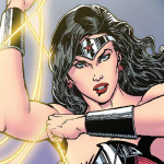
 Sensation Comics Featuring Wonder Woman #1
Written by: Gail Simone
Art by: Ethan Van Sciver
Colors by: Brian Miller of Hi-Fi
Letters by: Saida Temofonte
Published by DC Comics
“I’ll put your house in order, Bruce. And I won’t even need a car.”
DC Comic’s digital division has been putting out some of the most consistently solid work for the last few years. With Batman ‘66 and anthology titles like Legends of the Dark Knight and Adventures of Superman, it’s been a playground where creators can play with their iconic characters without having to tie into the New 52 continuity, so it’s about time Wonder Woman got her own title. Unfortunately, it doesn’t start out with a bang, or a whimper, but more of a bland.
Gail Simone has long been DC’s premier female writer, so it’s no surprise that she gets first crack at this Wonder Woman anthology title, but unfortunately she doesn’t give her much to do. The set-up is that Gotham City’s villains have joined forces and have injured (killed?) all of its usual heroes, so Oracle (returning Barbara Gordon, Simone’s signature character, to her pre-New 52 role) calls upon Wonder Woman to save the city. From there we get fifteen or so pages of Wonder Woman being “badass.” Much like with Geoff Johns’s Aquaman, Simone tries to make up for Wonder Woman’s perceived subordinancy to Superman and Batman by making her super-tough. Instead of using her usual magic lasso and bullet-proof bracelets, she’s outfitted with W-shaped knives that she uses to carve up the Penguin and Riddler and it’s just kind of stupid. Basically the comic is an attempt to get you to like Wonder Woman by making her Batman, and it just doesn’t work because there’s already two lady Batmans and it’d be a lot better if Simone wrote something that tried to put across why Wonder Woman is cool on her own merits.
The art doesn’t help manners, while Ethan Van Sciver is a darn good artist of the George Perez/Phil Jimenez hyper-detailed school, his work here lacks movement. Every character looks like they’re posing rather than actually doing anything. It’s like twenty pages of (very well rendered) portraits than an actual comic telling a story. The art, along with the writing, makes the whole thing a very stilted affair, while it looks great it just doesn’t read well.
This comic really illustrates the strengths and weaknesses of the anthology format. People may pick up this issue and be put off the comic in general, thinking it’ll be this mediocre going forward. However, if they stick with it, after this story’s conclusion next issue, there is a great line-up of creators in the pipe who will hopefully redeem this book from its first misstep.
Sarah Register is reading…
Written by Kelly Sue DeConnick
Art by David Lopez
Color art by Lee Loughridge
Lettered by VC’s Joe Caramagna
Marvel Comics
“If you move against them, you move against me.”
Kelly Sue DeConnick has been incredibly successful giving Captain Marvel a strong start in this phase of the Marvel NOW! relaunch. This week wraps up a storyline on the poisonous planet Torfa, which it turns out is not exactly poisonous. Captain Marvel and a little rag tag group of alien allies finally discover the Spartax Empire’s dirty secret in the mines of the planet, and the result is a revolution.
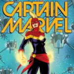
This cover art is my favorite in these first six issues–I love a good power stance and Captain Marvel is bringing it this week. David Lopez’s dynamic illustrations really pop with Loughridge’s color, especially during a space battle which is literally Captain Marvel going mano-a-mano with an entire fleet of ships. All the gorgeous space art contrasts nicely with the scenes on Torfa firma, which are more jaundiced and gritty.
Captain Marvel, like many of the Avengers, often functions best as a symbol. She learns a lesson in tact, meaning sometimes hitting things really hard is not the way to solve problems. The people of Torfa have got to stand up for themselves, and the best way for Captain Marvel to help is to buy them time (admittedly by hitting things really hard… in space!) to face their oppressors. DeConnick’s Carol Danvers not only has a lot of chutzpah, but also a lot of heart, and it’s gratifying to see her make friends and allies as she blasts through spaceships with her fists.
Thanks for reading about what we’re reading! We’ll be back next week with a slew of suggestions from across the comics spectrum. In the meantime, what are you reading? Tell us in the comments section, on Twitter or on our Facebook Page!


