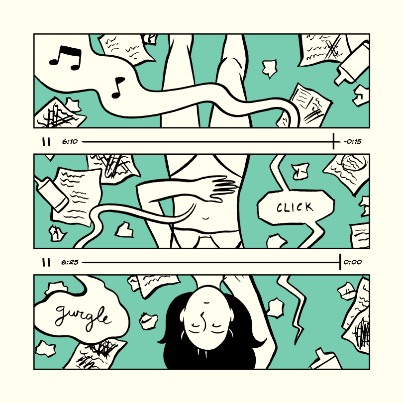
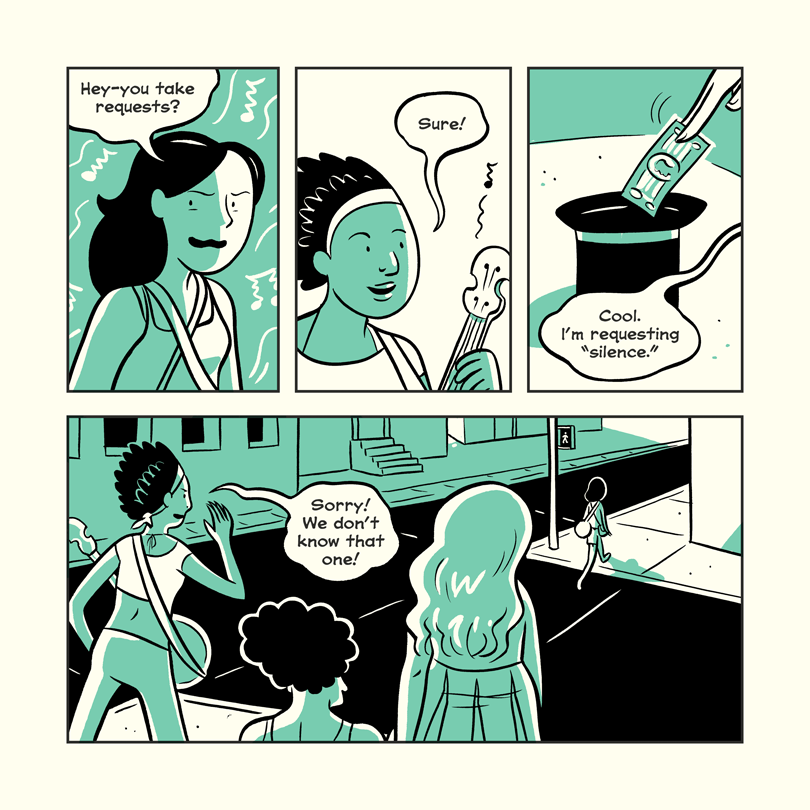
From long-running soap operas to comedy-drama slices of life to daily gag strips, the digital comics scene has exploded over the last decade and readers have never had more options. Feeling overwhelmed? Christina Harrington and Joe Stando are here to take you on an expedition through the webcomics wilderness and show you the best specimens in our monthly Deadshirt Webcomics Field Guide.
One thing I feel I don’t focus on quite often enough in this column is the actual format of a webcomic, in terms of the website design, layout, archive structure, etc. It might sound dry or nit-picky, but sometimes that makes all the difference. Comics without clear designs can be difficult to follow, and the main reason I drop a webcomic is probably losing track of my place or having trouble catching up. I bring this up because not only is this month’s spotlight, Solo by Hope Larson, a gorgeous, effective story, it also has some of the cleanest and most appealing layout and design of any webcomic I follow.
Solo follows Leah Turcio, former guitarist of Junior Twins, and her now ex-husband Andy. After announcing their divorce and the end of their band, they go their separate ways, and Leah runs into various issues with cars, money, and the like. The story meanders a bit, following incidental characters and minute interactions. It’s fundamentally a story about loss, not just the loss of a partner or a relationship, but the loss of direction and comfort and all the other things tied up in that. Larson has a knack for naturalistic dialogue, and interactions that seem simple on a surface level are often fraught with tension or sadness. That’s not to say that the comic is a downer. There are plenty of funny bits, in both a comedy-of-errors sense and in some good punchlines and bits.
Larson’s background is in long-form graphic novels, and it definitely shows in the pacing. Eschewing a newspaperish regular punchline or plot point format, many updates are characters unloading boxes or opening doors. This isn’t a complaint; on the contrary, there’s a level of craft and focus in what we’re shown that’s not common to serial webcomics. Each page builds on the previous one, stretching tension or shifting tone. The art is clean and clear, but also very expressive. Lots of pages feature clever compositions, from jagged panel breaks to the inclusion of phone screens and timestamps on songs. Not only are small moments like Leah drinking coffee evocative, they’re usually visually appealing, as well.
But like I alluded to early on, the story itself is matched by a solid, strong site design and interface. Solo is undeniably a book that’s being serialized, as opposed to more open-ended, ongoing webcomics, and it shows in the organization. Everything is clearly organized by chapters and viewable in a one page or two page spread format. The site is bright and matches the comic’s limited color palette.
The most novel element, however, is the inclusion of an audio player on the site itself. Solo isn’t the first comic series to include a playlist or soundtrack, but by including a widget to actually play it from the same page, the soundtrack becomes a much more integral part of the work. The soundtrack itself is curated by Michael Stock and features a variety of punk and indie tracks, some of which are session recordings from Stock’s radio show. It’s an immersive, sometimes melancholy playlist that helps expand on the themes of the comic. The use of pre-existing tracks is a solid choice; having a band write a song as the characters in the comic, for example, would be too much, but the selected songs help express the sound and vibe of Junior Twins well. Music is one of the hardest things to convey in a comic (the others are non-ridiculous dancing and stand-up comedy) and a good shorthand to the cultural scene and context of the comic’s world is appreciated. It’s also nice to see a use of the web format that incorporates other senses and interactivity. Scott McCloud described the internet as an “infinite canvas” for various different formats to emerge, but more often than not it seems to boil down to “really big pages you have to scroll through” and “gifs sometimes.” Solo goes a different way.
[soundcloud url=”https://api.soundcloud.com/playlists/49549495″ params=”auto_play=false&hide_related=false&show_comments=true&show_user=true&show_reposts=false&visual=true” width=”100%” height=”450″ iframe=”true” /]
Hope Larson’s Solo is also the first webcomic I’ve recommended in the column that doesn’t have a regular, fixed update schedule. According to the website, it’s a sort of side project that will ebb and flow as other priorities arise. Right now, though, the pace has been pretty steady, and there’s plenty of backlog to read. Definitely worth checking out.
Read Solo at Solocomic.net and be sure to check out Joe and Christina’s previous Webcomics Field Guides!


