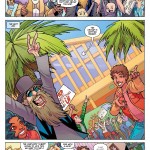
It’s Wednesday and that means new comics. Let Deadshirt steer your wallet in the right direction with reviews (and preview pages) of titles out today from Image, Dark Horse, IDW, BOOM! Studios, Archie, MonkeyBrain, Oni, Fantagraphics, Top Shelf, Action Lab, and more!
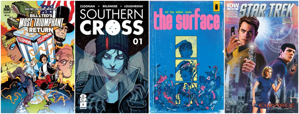
Southern Cross #1
Written by Becky Cloonan
Art by Andy Belanger
Colored by Lee Loughridge
Lettered by Serge LaPointe
Image
$2.99
Southern Cross follows Alex Braith, an antisocial “screw up,” and her journey aboard the titular interplanetary freighter on her way to collect her sister’s remains. Her sister worked for a mining company on Titan, and while deaths on a mining rig aren’t uncommon, she worked in administration. Alex takes it upon herself to retrace her sister’s steps to find out what happened. To get answers, she must navigate her way around the massive freighter, a too-social-for-her-tastes roommate, and the creepy-as-fuck guys inhabiting the Southern Cross.
Belanger’s art and use of space is fantastic. The vast size of the ship and its tight quarters are portrayed beautifully, eliciting feelings of awe and claustrophobia as needed. While scenes are crowded, they never feel overwhelming. Loughridge’s colors are consistent, and emphasize the interplanetary feel, offering some beautiful views of stars passing by.
Exposition issues are famously slow, deliberate, and seldom contain much story. Not Southern Cross #1. While I wouldn’t call it breakneck, it moves at a brisk pace without sacrificing the placement of important plot points. Seeds of upcoming plot points are planted throughout the issue and some start to grow even within this issue. This is best exemplified with the foreshadowed reveal of Alex’s roommate’s job and relation to her sister’s case. Not a frame or word is wasted – this isn’t just gearing up for something big, something big is happening now and the last panel proves the hell out of that.
– David Lebovitz
(Click thumbnails to enlarge)
The Surface #1
Written by Ales Kot
Art by Langdon Foss
Colored by Jordie Bellaire
Lettered by Clayton Cowles
Image
$3.50
This new series takes place in a frightfully trippy future, which views social media as a government-controlled watchdog and science as a conversation among 20-somethings on a drug-induced mind trip in their parents’ basement. The Surface is as cool as Hackers and as paranoid as M.T. Anderson’s Feed, but explores new dystopian territory by attempting to answer the question: “Is the universe a hologram?” The story follows three young adult hacktivists who go off-grid (a task far more difficult in this society) in order to answer this world-changing question. How? By locating The Surface, a “time-and-space traversing oasis” which seems to be born into existence with a blend of art, technology, and human ideas, and where reality is highly questionable. Keeping up so far?
Despite an incredibly complicated exercise in world-building, this is an intriguing “what if?” story with the mind-bending artwork to match. Langdon Foss displays great range, from a newly imagined world capital city in Tanzania to the absolutely “out there” concept of The Surface, pairing well with Jordie Bellaire’s various color palettes that likewise move effortlessly from realistic to psychedelic. Character designs evoke a kind of nineties underground comic vibe that almost borders on grotesque and gives the lead trio a hip, rebellious air about them, perfect for a group of young people fighting the Man.
What I enjoyed most about this first issue is that propaganda isn’t just a topic—it’s intricately layered into the comic itself. It interjects warnings in between the lines, and bombards you with random advertisements about plugging into the feed. Headlines ask “Would you like to know more?”, nodding to Starship Troopers and everything that film was likely referencing. Speculating about the future of social media and our relationship with technology is always a terrifyingly fun read for me, and this comic is bound to get you good and paranoid.
– Sarah Register
(Click thumbnails to enlarge)
Star Trek #43
Written by Mike Johnson
Art by Tony Shasteen
Colored by Davide Mastrolonardo
Lettered by Neil Uyetake
IDW
$3.99
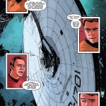
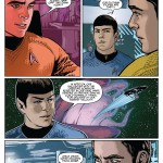
IDW’s ongoing Star Trek title has had a lot of time to kill between 2013’s Into Darkness and next summer’s film installment, and as a result, the series has long felt like it’s been doing just that: killing time. This issue opens where last month’s left off, with the Enterprise stranded in the Delta Quadrant, decades’ travel from home. (Something about this is familiar…) The crew now must find a way to get home, preferably in time for Star Trek 3. If this were to be the new status quo for the next year, riffing on Voyager and exploring new worlds along the way, it could be the shot in the arm that the series needs, drifting towards something rather than just plain drifting.
Taking place over the course of 50 days, we start to see how the Enterprise crew deals with the prospect of being trapped together on an extended voyage home (really, really well). We only get this period in snippets, as the plot really kicks in on Day 50, when the ship encounters Eurydice, the self-proclaimed “Savior of Deep Space,” who offers to tow them to a depot for refueling. The crew has little choice but to trust her, but they suspect she may not be as altruistic as she seems. (They’re right, of course, because otherwise there’s no story.)
The most disappointing thing about this issue—about most issues of this series, if I’m being honest—is how little I have to say about it. Mike Johnson knows how to write the characters adequately enough that nothing seems out of place, but nothing’s all that interesting, either. Tony Shasteen’s art is crisp and on-model, better than a lot of the more obvious photo-referencing artists this book has featured in the past, but the issue is devoid of any memorable images or exciting new designs. While this new story has potential, I would be lying if I said I expected it to go anywhere.
– Dylan Roth
(Click thumbnails to enlarge)
Bill and Ted’s Most Triumphant Return #1
Written by Bryan Lynch and Ryan North (back-up story)
Art by Jerry Gaylord and Penelope Gaylord (inks), Whitney Cogar (colors), and Ian McGinty and Fred Stressing (colors, back-up)
Lettered by Jim Campbell and Fred Stressing (back-up)
BOOM! Studios
$3.99
I have a confession: I’m not the biggest Bill and Ted fan. I think the first movie is decent, but the second, Bill and Ted’s Bogus Journey, always felt like it lost the thread of the story (such as it was) and veered into a lot of just plain weird territory. I was curious before I read this issue whether it would follow directly from the films, or just be a more general self-contained series. To be honest, I hoped for the latter.
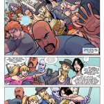
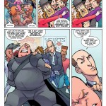
As it turns out, Triumphant Return is extremely faithful to the source material, which is actually really good for two reasons: first, it’s clear that both Lynch and North are coming into it with a strong background and understanding of the characters, which I can appreciate even if I’m not as into the second film. But it also makes this story feel more “canonical,” and lends it authenticity. The story itself picks up immediately after the climax of the second film, and carefully and meticulously rearranges things to allow for a more free-form story. Death, the princesses, and Bill and Ted Jr. are all still around, and they all get their due. But from the looks of it, the arc is going to be a simpler story about the deuteragonists traveling through time and (eventually) learning lessons. This is really exactly what I wanted out of the book: continuity or no, just some stories about two dumb, cool friends hanging out.
The art, both from the Gaylords and McGinty, also does something I like a lot. While Bill, Ted, and the other characters are easily recognizable, they don’t look like photorealistic illustrations of the actors. Like the continuity stuff, I don’t know how much of this was editorially mandated, but regardless, it’s the right call. Bringing a level (two levels, actually) of stylization to the characters helps elevate the stories beyond feeling like “tie-ins,” and into something new in their own right. They also take advantage of the greatest comic book innovation over movies: the ability to get super crazy without a huge budget. We get to see jetpacks and bright visions of the future much more vivid than the films could reasonably pull off at the time. All in all, it’s a comic that made me want to rewatch Bill and Ted’s Bogus Journey, which is no easy feat.
– Joe Stando
(Click thumbnails to enlarge)
Be sure to let us know what you picked up this week in the comments below, on Twitter or on our Facebook Page!

