It’s Wednesday, and that means new comics. Let Deadshirt steer your wallet in the right direction with reviews (and preview pages) of titles out today from Image, Dark Horse, IDW, BOOM! Studios, Archie, MonkeyBrain, Oni, Fantagraphics, Top Shelf, Action Lab, and more!
Archie #1
Written by Mark Waid
Art by Fiona Staples
Colored by Andre Szymanowicz and Jen Vaughn
Lettered by Jack Morelli
Archie Comics
$3.99
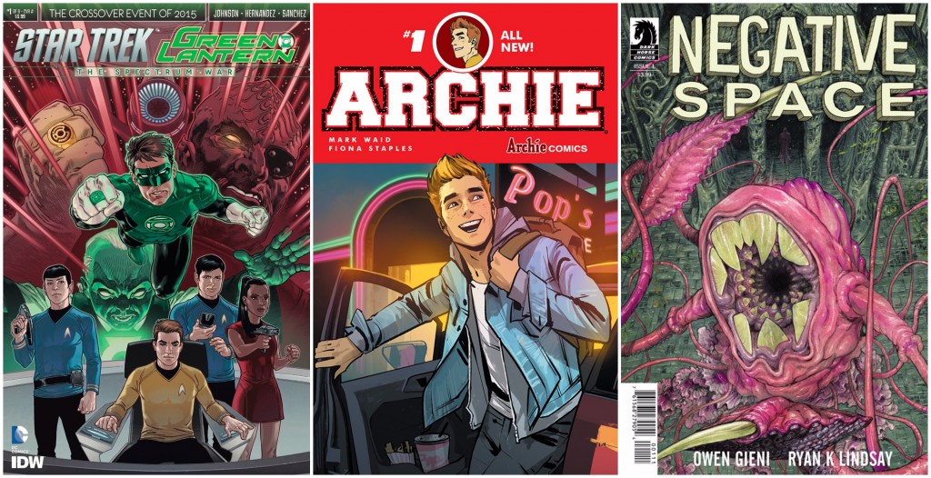
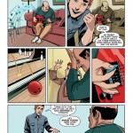
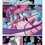
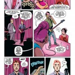
After major success in retelling the stories of Archie and friends with zombies, Satan-worshiping witches, and even the Predator, it’s about dang time they gave modernizing the original title the old college try. And boy howdy, with Fiona Staples on board this book is vibrant and fresh and absolutely welcome. Despite the characters sporting trendy styles and texting each other on bunny-eared iPhones, this premiere issue maintains that vintage-Archie spirit as Archie’s friends conspire to reunite him and his recent ex, Betty, by campaigning for them to win Homecoming king and queen. It’s a classic plot with notes of other childhood nostalgia (Archie constantly speaks to the reader with Zack Morris “Time out!” level of 4th wall breaking) that still manages to feel relevant—Archie even names his breakup with a hashtag.
I cannot stress enough how perfect the marriage is between Archie and Staples. Archie is…hot. It’s weird to say, but after decades of touting the title character as such a major heartthrob that two babes will battle over him constantly, he finally looks the part. Staples manages to infuse her own style into each individual character so that they still maintain their signature looks but also look like they could be any kid in the real world. Faces and body language are incredibly expressive and funny, and while I doubt I can look forward to turning the page to an alien monster pleasuring itself a la Saga, every panel is still a colorful visual treat in the wholesome realm of Riverdale High.
I have a feeling that, like me, a lot of readers will spend most of their reaction fawning over the art, because thus far it’s the most subversive thing about the comic. Mark Waid does an excellent job writing a classic issue of Archie, but what’s lacking is his signature wit. This is probably due to the fact that he seems to spend most of the first installment setting the stage for the series and almost no time fleshing out character personalities (aside from Jughead, who is cleverly written as a wise sage in the guise of a lazy glutton). The best part of the story so far is the buildup for the one major character that is blatantly missing: Veronica Lodge. Her arrival surely means a big change for Archie, but could also something almost sinister for Riverdale. I look forward to how this talented creative team will not only flip this beloved town on its head but also subvert the tired trope of two girls spending all their precious time fighting over a dude.
– Sarah Register
(Click thumbnails to enlarge)
Star Trek/Green Lantern #1
Written by Mike Johnson
Art by Angel Hernandez
Colored by Alejandro Sanchez
Lettered by Neil Uyetake
DC Comics/IDW
$3.99
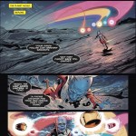
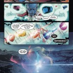
Something has killed all of the DC Universe’s ring bearers, leaving Ganthet, the last Guardian of the Universe, to protect what remains. In a last ditch attempt to save himself, he flees to another universe, where his body and the rings are discovered on a dead planet by the crew of the Starship Enterprise. While studying the rings, the Enterprise is confronted by an old (but new to them) foe and everything kicks into high gear.
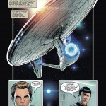
Much like IDW’s previous crossover, Star Trek/Planet of the Apes, this comic spends most of its time setting up the story before beginning the crossover proper at the end, but it’s time well spent. Unlike that crossover, ST/GL uses the post-reboot crew of the Enterprise, and they work well here. While the ST/POTA book was a clash of two sixties-era franchises, this one is much more contemporary (though it’d be fun to see the old crew meet up with Silver Age Hal Jordan). Writer Mike Johnson has the voices of the Enterprise crew down to the point where you can hear the actors in your head. I’ve been a fan of JJ Abrams’ reboot of the Star Trek universe, and Johnson does a great job of adapting the snappy dialog between the main cast members here. Similarly, Angel Hernandez does fine work at getting the actors’ faces down in his art without making it look like he simply traced over stills of the films. This is a very dialog heavy issue, but he manages to keep the “camera” moving so it keeps the art feeling like it’s posed.
I’ve spent most of this review talking about the Star Trek aspects and that’s because, while the rings show up, there’s not much from the other side of this crossover until the very end of the issue. But that doesn’t mean the book isn’t a fun time, especially if you’re a fan of the Enterprise‘s newest crew. The creators demonstrate here that they have these characters down and it’ll be cool to see them on a brand new playing field as this mini-series goes on.
– Jason Urbanciz
(Click thumbnails to enlarge)
Negative Space #1
Written by Ryan K. Lindsay
Art by Owen Gieni
Lettered by Ryan Ferrier
Dark Horse
$3.99
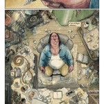
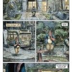
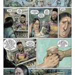
Negative Space is… interesting. The first issue follows a man who goes on a walk after getting writer’s block writing his suicide note, while a secret organization conspires to get him to off himself to fend off dark forces. The underlying story is similar to Cabin In The Woods—a man is manipulated by forces beyond his control who want him to die to appease some sort of overlord. The cover art is deceptive; the creature it depicts doesn’t show up until the very last page. This is clearly an exposition issue—far more action packed than most exposition issues, but an exposition issue nonetheless.
There’s not much in the way of funny banter, or even dramatic banter, but most of the humor in the book comes from the dark comedy connected to all the main character’s misfortune. Some of the best humor can be found in the art (such as a Louis CK stand-in and a coffee shop owner getting kidnapped), in part because the dialogue is trying so hard to find the balance between tragic and funny. The art is a bit exaggerated while still staying just based enough in reality to be relatable—think Mad Magazine, but with its feet firmly on the ground. It’s fluid and sketch-like while still feeling complete. It’s also used effectively without taking over the issue. There’s only a couple of splash pages, and they’re reserved for the big moments, making the smaller one-on-one interactions feels more intimate. Also, even though it’s only a few pages, Gieni’s depictions of water are really solid.
I’m not entirely sure where this is going and I’m not convinced the creative team entirely knows but it has certainly piqued my interest. Worth your time if you like horror/sci-fi comedy.
– David Lebovitz
(Click thumbnails to enlarge)
Be sure to let us know what you picked up this week in the comments below, on Twitter or on our Facebook Page!

