From long-running soap operas to comedy-drama slices of life to daily gag strips, the digital comics scene has exploded over the last decade and readers have never had more options. Feeling overwhelmed? Jen Overstreet and Joe Stando are here to take you on an expedition through the webcomics wilderness and show you the best specimens in our monthly Deadshirt Webcomics Field Guide.
This October, I was looking for something vaguely spooky or scary to cover in the Field Guide, on account of Halloween and all. Tessa Stone’s Not Drunk Enough provided it in spades, although not with the traditional ghosts and ghouls. Not Drunk Enough favors pretty grotesque body horror, but also style, action, and some pretty fun banter.
Not Drunk Enough follows Logan, a grumpy repairman dispatched to Varika Labs, a huge corporate installation, for some late night work. He and his partner, Abrahm, are immediately sucked into a world of hellish, mutated monsters, and end up separated. Logan bands together with a group of survivors from the corporation’s experiments, working with them to find supplies, an escape route, and the mad scientist behind all the chaos.
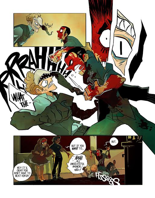
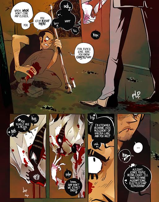
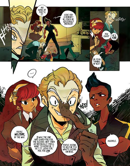
One thing that’s immediately apparent about the comic is that Stone is telling a complete story, rather than an ongoing daily or weekly comic series. You’re thrown right into the thick of it, with an in media res opening and some pretty immediate violence. It’s a comic that avoids a lot of table-setting in the story, which is a mixed bag, but more importantly Stone goes for broke visually on pretty much every page. There are no quick and easy four panel grids or repetitive close-ups. Each page is a scratch-built tableau, with wild action scenes and jagged, occasionally frenzied panel breaks even during calmer conversational pages.
Stone also has an incredible eye for character design, and this story is a perfect backdrop to use it. The monsters in the book range from comparatively subtle, like Varker, the arrogant scientist with a toothy mouth and prehensile tongue on his forehead, to openly horrific, like leech-faced shadow creatures or ambulatory torsos covered in eyes. Clothing in the series is also fashionable and suited to the characters’ personalities, imparting information quickly and efficiently. The blend of fashion and grotesquery is reminiscent of Tite Kubo on Bleach, but with a rougher edge. The lettering is big and loud (since characters are often yelling at each other), and it’s generally a wilder, more free flowing comic. It’s an impressive synthesis of styles that I haven’t seen elsewhere.
 I guess that if I have one complaint, it’s that the story is pretty glacially paced. It’s hard to recommend a book by word of mouth when it takes dozens of pages to learn the main characters’ names. Since the series is structured more like a long-form work than a serialized comic, I can understand not prioritizing cast pages or recaps, but it’s the kind of thing that could make the series a little less accessible for new or lapsed readers down the line. On the plus side, with updates twice a week, it’s a pretty easy comic to follow for now, and binging the archive is a pretty quick endeavor.
But overall, Not Drunk Enough is a relentlessly impressive comic, with a strong sense of action and design. It’s creepy but still light and energetic, and it features an impressive amount of craft.
Not Drunk Enough updates Tuesdays and Thursdays over on http://www.ndecomic.com/.


