Max Robinson is reading…
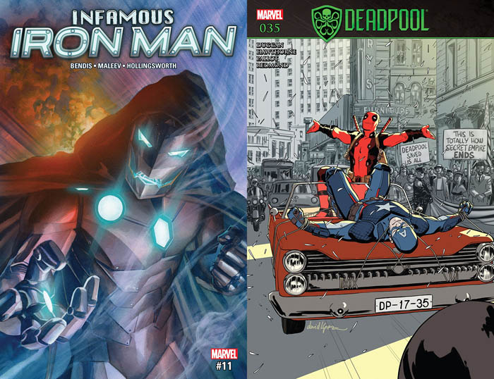
Infamous Iron Man #11
Written by Brian Michael Bendis
Art by Alex Maleev
Colored by Matt Hollingsworth
Lettered by VC’s Clayton Cowles
Marvel Comics
“I KNOW I AM A MOCKERY NOW AND I HAVE NO ONE TO BLAME BUT MYSELF!”
Bendis and Maleev’s unorthodox Fantastic Four ongoing has finally crescendoed as it heads toward the end of its first year and, speaking as someone who only sporadically enjoys comics from both creators, this is a masterful superhero comic. Bad guy trying to be a good guy Victor Von Doom, superhero-turned-erstwhile parole officer The Thing and the clueless muckety mucks of SHIELD have spent a few issues trying to determine who exactly is responsible for the seeming return of Doom’s mother, and here all the cards are laid on the table. Bendis, to his credit, manages to pull off a genuinely surprising reveal that longtime Doom fans will appreciate while still raising the stakes Doom and co. face.
This is another issue of characters largely talking and — while Bendis’ hyper-quippy take on issue guest-star Dr. Strange is occasionally grating (I’m sure that “Autozone” joke will age like fine wine) — the talkiness of the comic is justified in just how much these interactions move the story forward. Sequences like Doom and Strange speaking like old frenemies on the astral plane as they try to figure out who’s posing as Reed Richards or an out-of-her-element Sharon Carter attempting to poker-face an ancient primordial evil are compelling and, thanks to Maleev and Hollingsworth’s visuals, pack a real punch. Hollingsworth’s colors deserve special props here, especially in how hot pink is used as a visual shorthand for sunset hitting a Project Pegasus facility and in how he gives a longtime Marvel force of nature appropriate flair on the final page. While Maleev’s faces sometimes feel too obviously sourced, his expressions here are subtle in a way I appreciate.
Infamous Iron Man is one of those books with a premise that, by super hero comic necessity, can’t stick around for too long, but Bendis and Maleev are delivering a Dr. Doom-gone-good story that makes the most of its core conceit.
David Uzumeri is reading…
Deadpool #35
Written by Gerry Duggan
Art by Mike Hawthorne
Inked by Terry Pallot
Colored by Ruth Redmond
Lettered by VC’s Joe Sabino
Marvel Comics
“Yeah. It was the best.”
Secret Empire might have been an absolute clusterfuck for the vast majority of the Marvel Universe, but it’s been a dramatic goldmine for Deadpool, which has taken the very core conceit of the series (Captain America goes bad) and sets that straight against what Deadpool always saw as his one redemptive moral compass: his hero worship of Cap.
Deadpool’s a complete shitbag of a human being who works best in stories that are so shaggy-dog and hard-luck that you feel bad for someone like him. The idea of your #1 idol in life bringing you up to the highest loft you think possible only to drag you down further than you ever thought you could go is a relatable fear. Captain America is Deadpool’s ultimate Milkshake Duck, and now all he gets for believing in the most revered moral figure of his time is being forever associated with that summer the United States went full Nazi.
This is essentially the endpoint of a year or so of Cap’s emotional abuse of Deadpool, featuring just him, two beers, and the sure knowledge that he’s completely fucked things up this time, that he really tried his best to be a good person and the world shat on him for showing faith in something for once. I don’t usually have emotional responses to comics, but I found this arc of Deadpool to be a sobering, depressing, borderline painful-to-read story that was the only way any of this could have ended and is heartbreaking to see either way.
Duggan and Hawthorne have been working together on this book for years; while it’s had a number of artists due to a sometimes-accelerated release schedule, Hawthorne’s been dependable, and it’s fitting that he’s here at the end of the only really happy era Deadpool’s had in his life. Ruth Redmond works a number of coloring tricks; the precedent Jordie Bellaire set up with coloring the environments to contrast with Deadpool’s red outfit works wonders here. But honestly, it’s the sense of finality that’s the star of the show. It’s a depressing pleasure to see talented creators stick the landing on an era like this, especially in the context of such a bogglingly godawful event, but I think we would have gotten a version of this story with or without Secret Empire, and this version was pretty damn powerful.
Mike Mastropietro is reading…
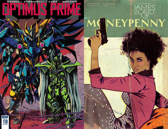
Optimus Prime #10
Written by John Barber
Art by Kei Zama and Livio Ramondelli
Colored by Josh Bircham and Livio Ramondelli
Lettered by Tom B. Long
IDW
“And you admitted stories are lies. Why would I believe any of it?”
It’s time to talk about Livio! Livio Ramondelli is IDW’s #1 guy when it comes to Transformers fill-in work, and this exposure has made him perhaps the most reviled artist currently working in comics for issues related to their art (as opposed to their politics, history of harassment or repeated art theft). Ramondelli’s style is loose and thin pencil lines under heavy and dark digital coloring. His figures are often off model and have proportions which warp panel to panel and the coloring is intentionally murky and obscuring.
And when a story fits his style, like this one here, I genuinely dig it. His art is used here specifically to represent ancient history told by an unreliable narrator and, intentionally or not, the murkiness and otherworldly glow that his coloring brings to every page helps get across that feeling. For me, when the subjects are nebulous and mythical, consistency becomes less important than feel. So, I think Ramondelli’s a good fit, and it is fortunate that most of his work recently seems to be pairings with Barber, who has a good handle on where to use the artist’s specific flavor.
Optimus Prime #10 is a story within a story, with the framing sequence art being provided by regular creative team Kei Zama and Josh Burcham who bring A+ work with Zama’s incredibly detailed and dynamic pencils under Bircham’s throwback coloring. Bircham has been doing things with ’80s-style color pallets and printing textures that is super special right now, and it’s what brought me to the book in the first place.
Barber uses the shift in styles to move from current plot lines into a previously established “Barbarian” setting as told by Old-As-Shit robot Alpha Trion. As with previous ventures into this period, the story is pretty much 80% world building, deepening the myths and legends of the Transformers gods that have been running through the books for years being deepened and raising more questions. What makes this work better than previous attempts is the continued thread raised by several characters about the unreliability of stories. The doubt helps sell these figures as larger-than-life when they could have easily come off as Just Some More Robots.
The last issue of this series was so good it convinced me to return to writing about comics. This issue does not reach those heights, but it uses two distinct visual styles to sell a narrative setting that I’ve turned my nose up at in the past, so I call it a success.
Plus there’s a great gag with a cute dog.
David Lebovitz is reading…
James Bond: Moneypenny
Written by Jody Houser
Art by Jacob Edgar
Colored by Dearbhla Kelly
Lettered by Simon Bowland
Dynamite
“Oh, leave Agent Moneypenny alone. She’s here to protect us, after all. Who knows what FEARSOME deep sea creature could try to consume our plane mid-flight?”
“Are you going to tell me I’d look prettier if I smiled next?”
James Bond: Moneypenny tells a solo tale of Ms. Moneypenny (based on – but not explicitly – the version depicted by Naomie Harris) on a security detail. It’s a decent action comic that is… fine. Just fine. It has some decent action and a simple storyline. It’s easy to digest. It’s cool to see Moneypenny kick ass. But as far as one-shots go, it’s disposable.
The comic jumps back and forth between the past and the present. The first page shows a young Moneypenny watching a news report with her family about a terrorist attack before jumping to her current assignment on security detail. Peppered in are other flashbacks of her childhood and her training, but all are full of missed potential. One page shows Moneypenny as a child comforting an Arab friend who was bullied, with the friend responding that Moneypenny should have stood up to the bullies. It’s a great idea for an origin and would make for a great callback, but it’s never referenced again nor is Moneypenny put in any situation where it would be relevant. James Bond (bearing no resemblance to Daniel Craig or any other actor who ever donned the tux) makes a cameo, indicating that this takes place after Moneypenny is assigned desk duty, but where the story fits in any continuity is up in the air.
James Bond: Moneypenny is light on dialogue, but that’s almost by design – Moneypenny herself spends most of the issue shadowing someone, observing rather than commenting. (This is probably the closest any James Bond property ever gets to what being a secret agent actually entails.) This helps the comic, because it shows how competent she is when the time comes for her to shine. The build to the action sequences is well paced. It just feels that, when all is said and done, this issue was filler. Not bad filler, but filler nonetheless – not a good descriptor for a one-shot.
Edgar’s art is solid if imperfect, combining the retro style associated with classic Bond with a more modern, streamlined look. Occasionally the action can get confusing, and the layout isn’t perfect, but it gives off the right emotion. Kelly’s colors are the true star – especially when she uses them to emphasize how Moneypenny scouts a room and identifies threats. It feels like this issue could have used a bit more attentive editing – gunshots don’t always follow a linear path on the page, and I think I picked up a superfluous word in a place where it doesn’t even make sense in dialogue.
Moneypenny might make for a decent series, but as a one-shot, it’s too hollow to get invested. There’s no depth here, and it’s nothing special, but if you have five extra dollars and want to read a story about Moneypenny shooting a bunch of bad guys, it’s a decent pick up.
Thanks for reading about what we’re reading! We’ll be back next week with a slew of suggestions from across the comics spectrum. In the meantime, what are you reading? Tell us in the comments section, on Twitter or on our Facebook Page!


