Deadshirt is Reading… is a weekly feature in which Deadshirt’s staff, contributing writers, and friends-of-the-site offer their thoughts on Big Two cape titles, creator-owned books, webcomics and more.
Robby Karol is reading…
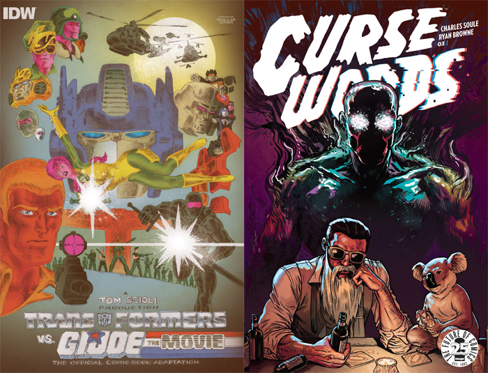
Transformers vs. G.I. Joe : The Movie: The Official Comic Book Adaptation #1
Written, Drawn, Colored and Lettered by Tom Scioli
IDW
“Usually they stow us in boxes with the rest of the war toys.”
This is a strange comic to be reviewing. Tom Scioli co-wrote, drew, colored and lettered 13 issues of a Transformers vs. G.I. Joe comic book that IDW published over the last two years. This new comic is the “official” comic for a (fictional) movie adaptation of the prior series. In other words, this is the comic book adaptation of a movie that doesn’t exist, based on the comic book that Scioli already did. Got it?
Sure, it’s a weird concept, but what I loved the most about the original Transformers vs. G.I. Joe series was the weirdness that Scioli brought to it. And there is some value to the “adaptation” as well, even if it does feel more like an extra from the Blu-Ray than the feature presentation.
For one thing, while Scioli played with panel composition and layout to great effect in the original series, here he self-consciously limits himself to more “widescreen” panels that take up the length of the page. The effect is to recreate the fast pace of franchise action films, as well as replicating the overwhelming size of seeing a movie on the big screen. Scioli’s art has a more kinetic charge than it sometimes did in the series’ idiosyncratic panel layouts and lovingly rendered double-page spreads.
The story itself also feels like a self-conscious attempt at a simplified, streamlined “movie” narrative. Where the series let Scioli take stylistic and narrative detours in rewarding ways, the adaptation quickly kicks into first gear with the Joes invading Cybertron and following their fight. Some of the charm of the original series is lost, as the grace notes are swept to the side for Action! If the original series felt like an epic play session with your favorite toys, this feels like trying to wrap up your story when Mom’s going to pick you up from your friend’s house in 15 minutes. Or like a franchise film trying to set up a new status quo for the next film in the final act.
However, to compensate, there’s a bunch of fake press kit material in the back half where Scioli’s sense of humor is allowed to shine more, as well as layouts and other miscellaneous promo art for the original series.
If you haven’t checked out Transformers vs. G.I. Joe yet and are interested, it’s better that you actually check out the original series. But for people who want to enjoy Tom Scioli playing in his toy box for a few more pages, you’ll probably get a kick out of this.
David Uzumeri is reading…
Curse Words #3
Written by Charles Soule
Art by Ryan Browne
Colored by Michael Garland, Ryan Browne and Michael Parkinson
Lettered by Chris Crank
Image Comics
“Don’t WANNA go. No POINT. Wanna stay HERE… with the… pretty LADIES.”
You know when someone describes a book to you as “completely fucking stupid,” but they do it with a huge-ass shit-eating grin on their face? That’s basically how I feel about Curse Words. It’s powerfully dumb, but the kind of dumb only really smart people can concoct.
The general concept is that the dark lord of an alternate dimension called the Hole World, who goes by the name of Sizzajee, sends his most powerful lieutenant, the grand wizard Wizord, to Earth to help him conquer it. Instead, Wizord gets a hipster haircut, a sweet roadhog and a penthouse office, because he decides being a celebrity is way more fun than being a knock-off Mouth of Sauron. Now Sizzajee is sending people to try to kill him, so he’s accidentally forced to protect the Earth because he enjoys junk food and whiskey too much. It’s a whole fantasy world seemingly imagined and named by a couple twelve-year-olds at a sleepover who just read their first Penthouse Letters, and it’s a delight.
The thing is, it’s not made by two twelve-year-old boys; it’s made by two talented storytellers tapping into that reservoir of unfettered imagination and an utter lack of filter, but within the framework of a story that makes sense. There’s coherent world building going on, even if it features ridiculous characters and dumb situations, and Wizord is the kind of cluelessly charming antihero that works with both New York observational comedy and pining over his lost love from the Hole World.
Charles Soule has been writing something like five or six Marvel comics a month for the past few years, so it’s a pleasure to see him to back to the semi-comedic roots of his first major Marvel hit, his delightful She-Hulk run with Javier Pulido. Ryan Browne I’m less familiar with, although his art and narrative sensibilities on display here certainly make me want to check out his earlier sci-fi comedy stuff, like God Hates Astronauts. It’s just a blast to see two talented storytellers let loose with something this baldly and unapologetically entertaining.
Andrew Niemann is reading…
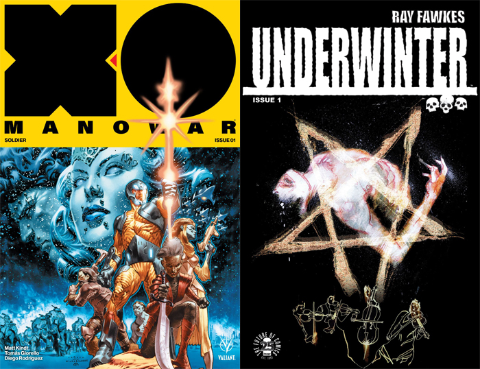
X-O Manowar #1
Written by Matt Kindt
Art by Tomas Giorello
Colored by Diego Rodriguez
Lettered by Dave Sharpe
“The gears of war grind no matter what. No matter where.”
X-O Manowar is one of those early ’90s attempts at creating an original comic book character that should be cooler than he’s actually portrayed. Created by Jim Shooter and Bob Layton for Valiant Comics, his whole deal is basically like space barbarian Iron Man, and his stories are kind of a medium between Conan the Barbarian and Thor. Most of his adventures cast him as a fish-out-of-water human from Earth who finds sentient armor that helps him fight technologically advanced alien races on other planets. Valiant revived the series a few years ago to some acclaim and restarted the series again this year, as written by Matt Kindt with art by Tomas Giorello and Diego Rodriguez.
The first issue is fairly standard as far as “origin” stories go, although it is implied that Aric (Manowar’s human name) already had adventures with the titular armor and has now retired to farming and being a husband. Of course, the gears of war on the planet draft Aric back into the fold, and he struggles with becoming the Manowar again. This issue makes a bonehead move, which I think many of these modernized first issue reboots struggle with, saving the character in his full armor for the next issue. I know it’s an incentive to get the audience to buy the next issue, but it doesn’t make sense, because the new design is right on the cover. The one big positive thing about this issue is that the art is absolutely fantastic. This is probably the most beautiful comic I’ve read this year, with every page looking visually cinematic. The use of light and shadow makes this comic come alive.
The issue contains large awesome battle sequences on the back end, featuring Aric tackling space knights and large beasts with lasers shooting out of their heads, which truly look like something out of Heavy Metal. If the writing for this issue were as good as the art, I think this would be a can’t-miss book, but unfortunately it’s going to be lumped into other bland superhero books that aren’t from the Big Two. It doesn’t reinvent the character in an interesting manner that is going to create any new fans or cause old fans to want to pick it up.
David Lebovitz is reading…
Underwinter #1
Created, Written, and Drawn by Ray Fawkes
Lettered by Steve Wands
Costume Consulting by Dani V.
Variant Cover by Jeff Lemire
Image
“This is a gig. We’re all dying here.”
Underwinter has a clever setup and seems to have a novel concept, but it’s a story that’s clearly in love with itself. That’s a risk common to creator-owned comics, but good god is it evident here. Though advertised as a horror comic, Underwinter doesn’t quite fit that description – at least, not yet. It’s certainly creepy and atmospheric, but there’s not much in the way of horror nor terror, save for the bizarre last panel. If you’re going to pick up this issue, don’t skip to the last page – you’ll want the buildup to that.
Underwinter‘s story is in its early stages, but it follows a band of bickering musicians who agree – for a large sum of money – to perform for a wealthy, mysterious client. This comic went by fast, and it was almost entirely because of low-dialogue splash pages. The art is beautiful – a kind of minimalistic watercolor – but it’s better suited for a painting than for a comic in some ways, especially because characters are seldom given defining physical characteristics. My borderline preternatural dislike of splash pages is well documented, and there are times this issue just made me sad. Beautiful full-body paintings are nice to look at, but if they’re not advancing the story – and they seldom are – nor telling us much about the characters, they’re just there to take up space and stroke someone’s ego. Please, please, please cool it with the splash pages, especially in a creator-owned monthly. You have both the time and occupational obligation to write some damn dialogue. I have a hard time appreciating your beautiful art if I’m genuinely concerned this review has more words than your comic.
I’d recommend waiting at least another issue, or maybe waiting for the trade.
Thanks for reading about what we’re reading! We’ll be back next week with a slew of suggestions from across the comics spectrum. In the meantime, what are you reading? Tell us in the comments section, on Twitter or on our Facebook Page!


