Deadshirt Is Reading… is a weekly feature in which Deadshirt’s staff, contributing writers and friends-of-the-site offer their thoughts on a diverse array of comics, from name-brand cape titles to creator-owned books to webcomics.
Christina Harrington is reading…
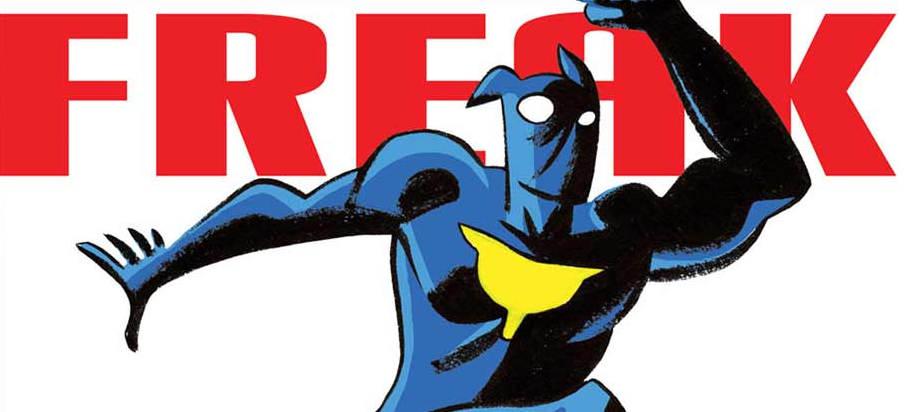
The Fox: Freak Magnet (TPB)
Written by Dean Haspiel (Plot: Freak Magnet part 1-4, Script: A Picture Lasts Forever), Mark Waid (Script: Freak Magnet parts 1-4), J.M. DeMatteis (Plot and Script: Freak Magnet part 5, The Face of Hate)
The Fox: Freak Magnet opens with our main character Paul Patton, Jr. getting beaten up by two thugs. Luckily for Paul, he’s also the Fox, and he knows ten, make that eleven different ways of escaping his current, unlucky predicament. Journalist by day, the Fox by night, Paul has stumbled upon a plot of apocalyptic proportions and, of course, it’s up to him to save the day. After he does, the Fox just keeps getting pulled into adventure after adventure, each tinged with a hint of the supernatural and fueled by the Fox’s perpetual bad luck. Headed by Dean Haspiel and Mark Waid, The Fox: Freak Magnet is a well-paced and good-natured modern superhero pulp.
Freak Magnet is old school, with new school elements layered on top. Paul works for a newspaper and uses a film camera—both of which are openly mocked in-story—and while one of the villains—a demoness calling herself Madame Satan—uses the internet and social media as part of her evil plan, she still takes the time to explain this plan to the Fox, much like a Scooby-Doo criminal or Silver Age comics villain might. But why reveal this secret plan to the hero mid-fight? “Because I don’t know if it works,” Madame Satan says, “Or even how it sounds. There are no marketing tools, no focus groups fit to evaluate an apocalypse.” There’s just something so modern about a bad guy who worries about public perception.
The art is simple with crisp lines and simple backgrounds, and while this adds a nostalgic feel to the book (you could almost picture this art fitting in with silver age work), the colors are what brings this book into the 21st Century. Nowhere is this better shown than in Chapter Two: Diamonds are a Girl’s Best Friend. In this chapter, the Fox finds himself on an alien planet filled with gemstones and strange landscapes. Frosty blues and neon pinks light up the pages, placed with a deft touch by Allen Passalaqua. These colors add a contemporary shine to the classic line art.
The use of panels also pulls the Fox into modern graphic narrative, employing big spaces and movement along the page that really brings the character and situations to life: a raft floating along a fushia river flows down the page, running left to right as the Fox and his companion are swept down a waterfall, while small insets highlight their conversation so we don’t miss anything in the bigness of the page; a fake head bounces down a flight of sparkling blue diamond steps, taking advantage of a well-place ‘L’ shaped panel; a two page spread follows the Fox as he crawls through an underground tunnel filled with traps and monsters, as our hero makes plans for the time he’s going to have after he gives up the superheroics; these are all excellent examples of the medium being utilized through contemporary storytelling techniques.
This collection is fun, and funny, too. Its humor is self aware without reaching Deadpool-levels of saturation, and Paul’s sarcasm makes it all the easier to root for him. The Fox is interesting without having to know his backstory, which means that new readers can enjoy this collection without having to rely on a nostalgic veneer. Really, the only place I struggled was with the backups, called A Face of Hate, that recounts a World War II adventure by Shield, a Captain America-esque character.
I slogged through these back-ups secure in my knowledge that I could find a better “super soldier fights nazis” story in All-New Invaders from Marvel. And though the Lovecraftian reveal at the end of the second issue wasn’t expected, I can get those stories from Hellboy or BPRD. I struggled through the story, which only improves when it (SPOILER ALERT) connects back to the main plot and the Fox, through some time travel and plot stretching, joins the fight. The ending of the arc could feel cheesy (basically: the power of love saves everybody), but really, it’s just another moment in many that establishes what kind of story this is: a sincere, classic superhero adventure being told through a modern lens.
Jason Urbanciz is reading…
Written and drawn by Skottie Young
Colored by Jean-Francois Beaulieu
Lettered by Jeff Eckleberry
Marvel
“Well, this day just keeps getting better and better.”
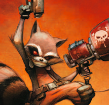
Improbable as it would have seemed even two years ago, Rocket Raccoon is a growth industry. Introduced in an issue of Hulk and given his own mini-series back in the early 80’s, Rocket was brought back during the Annihilation: Conquest cosmic event seven years ago and has somehow grown to prominence. He is now part of the ensemble of a $100 million movie, and Marvel’s second biggest series launch of the year (after Amazing Spider-Man). That’s downright weird, but pretty cool.
The comic itself is a bit weird, but also very cool. There’s not a lot of story to it–Rocket rescues a princess, attends a wrestling match, and then runs for his life–but writer and artist Skottie Young makes the comic move at a snappy pace that doesn’t seem too fast. Basically a sci-fi, slapstick caper book, the issue lays out the central mystery of the opening arc pretty quickly, even if the final reveal of the issue comes off as rote, like Young ran low on ideas when he hit the last page of the script and saw a copy of Scott Pilgrim sitting on his shelf.
While the story runs out of gas at the end, the art is spot-on. Young’s scratchy, animated style is truly unique and makes the book different from most everything on the stands. He’s aided in this by color artist Jean-Francois Beaulieu, who gives the book a lovely palette, moving from purples and greens of the opening segment to deep reds and oranges of the middle scenes. This book is neon bright like Times Square, so I’d recommend picking it up digitally. Marvel’s rough paper tends to eat up those colors, whereas it just shines on my iPad screen.
Kayleigh Hearn is reading…
by Frank Miller
Dark Horse
“Sin City dames. Ain’t nothing like them nowhere.”
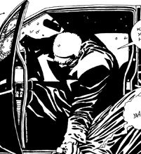
Released in preparation for the upcoming film Sin City: A Dame to Kill For, the book The Art of Sin City is a crash course in Frank Miller’s hardboiled comic. Sin City is arguably Miller’s last great work, set in a lawless world of black and white and populated with crooks, dames, and killers. (Color—bright splashes of red and yellow, and even a full-color sequence–would come in later volumes.) The Art of Sin City collects some of the most striking images and splash pages from the long-running comic, along with covers, sketches, and other rarities. If the omnibus Big Damn Sin City is a full bottle of whiskey, The Art of Sin City is the first shot that burns your gut going down.
Sin City’s artwork is stunning. This is Frank Miller at his peak; even stripped of their context, his stark black and white comics pages are riveting and suspenseful, and his use of negative space is a revelation. Rain on a dark city street becomes scratches on a film negative, and Marv walking through snow is like passing through a Jackson Pollack painting. Wisely, the pages also include their original text; the art would feel oddly naked without Miller’s raspy tough-guy talk. (Says one dame: “Damn it, Dwight. Damn it. You fool. You damn fool.”) This is some of Miller’s best work, but it’s also where he begins to slip—there are only so many pages of nude, scowling prostitutes wielding phallic guns I can look at before I start rolling my eyes. Forget it, Jake, it’s Sin City. (Damn it, now Miller’s got me talking in noir clichés too!)
The book features a few behind-the-scenes sketches but sheds little light on Miller’s artistic process. It would have been interesting to see more developmental designs showing how he created such visually striking characters as Marv, Nancy, Miho, and other Basin City denizens, but they’re not here. By now, you know you either love Frank Miller or you hate him, but The Art of Sin City is an interesting detour into a rough part of town.
Joe Stando is reading…
Written by Jason Aaron
Art by Mike Deodato and Frank Martin (colors)
Lettered by Chris Eliopoulos
Marvel
“I figured this was the same job I’d always been doing, just… a bit bigger in scope.”
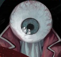
Original Sin has continued chugging along this summer, and a lot of the disparate pieces of the story are starting to come together. This installment is all flashbacks and reveals, as we follow the even-more-secret history of Marvel’s premier secret agent, Nick Fury. I’ve mentioned before how much I love exploration of the Marvel Universe’s retroactive “dark age” between WWII and the modern era, and this was basically a love letter to that concept. Nick Fury traveling the various corners of the universe, sniping monsters and aliens before the dawn of superheroes is a great idea, and one that’s totally believable as a role for Nick Fury.
Indeed, the key to the Original Sin event has been psychological realism, with characters behaving in reasonable ways and with reasonable motivations. Treating a story that involves both living planets and higher planes as existence as a gritty mystery sounds like a hard sell, but the deliberate focus on the cast sells it. Deodato’s page compositions continue to be breathtaking, and a lot of the art in this issue specifically feels like it hearkens back to pulp heroes and early Marvel. Nick Fury’s account of his “second job” looks like it could fill several ongoing series, but I like that we’re just given glimpses throughout his life.
My only complaint this week is that so much of it is flashback, and it’s constructed in such a specific way, that a lot of questions from the past couple issues are still largely unanswered. But I’m thankful for this diversion, and I trust that things will pick right back up next time.
Thanks for reading about what we’re reading! We’ll be back next week with a slew of suggestions from across the comics spectrum. In the meantime, what are you reading? Tell us in the comments section, on Twitter or on our Facebook Page!


