Deadshirt Is Reading… is a weekly feature in which Deadshirt’s staff, contributing writers and friends-of-the-site offer their thoughts on a diverse array of comics, from name-brand cape titles to creator-owned books to webcomics.
Dominic Griffin is reading…
Written by Warren Ellis
Art by Declan Shalvey (pencils) and Jordie Bellaire (colors)
Marvel Comics
“I’ve died before. It was boring, so I stood up.”
There’s something to be said for the Hawkeye-ization of third string solo titles in the Marvel Universe, bringing in singular creative talents to put their own idiosyncratic, experimental stamp on characters no one would likely care too much about otherwise. It’s fun to see these titles that eschew a house style and just kind of go for it, you know? Warren Ellis has deigned to bless us with his presence on a Big Two cape comic again, and he brings with him all of his gruff, sardonic narrative stylings. This new take on Moon Knight, as a besuited detective who hunts grisly killers in the night, feels like a suped up version of another Ellis comic, Fell. First issues are difficult, but this one accomplishes it’s goals. Slyly and efficiently addressing past continuity and subtly mocking Bendis’ entire misbegotten run on the character with a wink, this is a first issue that deftly sets up a new status quo for long time fans while bringing new readers up to speed with ease.
Shalvey’s line work has just the right amount of gristle on it to imply a sense of grit without losing a certain kind of slickness that keeps Moon Knight from being just another typical noir comic. Ditching the cape, visually, feels perfectly in line with the refinement approach Ellis has taken with the plot construction. I haven’t found any new words to praise Bellaire’s color work that haven’t already been said elsewhere, but the way the color white is set against the cool dark of the night and some of the ghastly, warm reds of the book’s big action piece is astonishing. My only gripe is that Ellis has reached a part of his career where his mainstream comics work feels more like a lark, something he’s doing to pass the time. It isn’t helped that he has a tendency to write all of his characters to sound as cynical and beleaguered as he is, making it feel like a one man show. Regardless, this take on Moon Knight is my personal favorite since Charlie Huston’s run with David Finch and it’s definitely worth checking out.
Written by Jason Latour
Art by Mahmud Asrar (pencils) and Israel Silva (colors)
Marvel Comics
“It’s what we were made to do. Maybe it’s all we can do.”
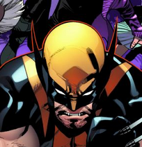
I made one giant mistake with this comic: I read it immediately after finally reading the last two issues of Jason Aaron’s incarnation of the book, 42 issues of what probably amounts to my favorite X-Men series ever. Aaron’s artistic collaborator on the upcoming Image series Southern Bastards has stepped into his shoes, writing the All New Now Marvel Now (Right Now Come On) relaunch of the popular adventures of the students and faculty of The Jean Grey School for Gifted Youngsters.
The new #1 usually means a drastic change in direction, but Latour, somewhat smartly, seems to be steering the ship in his own direction without forgetting what brought the team to the dance. The cast is all here, with welcome addition Fantomex looking to join the teaching staff in the first arc, and more emphasis is placed on Quentin Quire, making him the book’s teen lead of sorts.
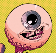
One has to wonder if placing Quentin front and center doesn’t reek of the same criticisms lobbed at the creators who first started pushing Wolverine himself out of the comfortable supporting act shadow and into the limelight. Meeting the character here at this crossroads, having just graduated and now moving into a role as a teacher’s aid, doesn’t help any, as his confusion and turmoil reads as inconsistent characterization out of context. Latour finds some moments with Eyeboy to impose a more personal sense of humor on the title, making a departure from Aaron’s signature insanity. Mahmud Asrar did some respectable work on Brian Wood’s under-read Ultimate X-Men and his images pop with a youthful vibrance that works for the title’s tone, but lacks some of the flair that previous artists Nick Bradshaw and Chris Bachalo. As a first issue, this one feels more like a television pilot. There’s enough to like here to keep reading, but I’m hoping it hits it’s stride before the arc is over.
Max Robinson is reading…
Written and lettered by Rick Spears
Art by James Callahan (pencils) and Luigi Anderson (colors)
Oni Press
“When I was about twelve it hit me like a bolt from the blue.
All women have pussies.”
The first issue of Oni’s The Auteur is the most unpleasant, ugly comic I’ve read in a very long while and it’s fuckin’ great. The comic follows odious Hollywood producer Nathan T. Rex at the brink of insanity after the failure of his latest big budget space opera at the box office. He needs his upcoming slasher flick, President’s Day, to be a hit or he’ll be utterly ruined.
What immediately endeared me to The Auteur is that, while it’s about “the creative process”, it isn’t at all precious about it. Nathan T. Rex is a cowardly, pill-popping scumbag who oogles women and yet as we watch his brainstorming crescendo into a really repulsive but potentially lucrative idea, you sort of have to root for him.
Callahan’s pencils, along with Anderson’s Skittle rainbow color array, are what make this issue sing. In particular, the way they work in tandem to depict Nathan’s various hallucinations; there’s a palpable MTV Liquid TV feel to scenes of Abraham Lincoln’s axe splattering open Nathan’s brain or a man exploding into snakes.
The Auteur is a comic that revels in its tastelessness yet somehow avoids being, you know, a Mark Millar comic. It’s vile, it’s funny and I think you’re going to dig it.
Written by Ed Brubaker
Art by Steve Epting (pencils) and Elizabeth Breitweiser (colors)
Letters by Chris Eliopoulos
Image
“…and if spies wanted to be part of real life, they’d never have left it in the first place.”
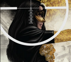
Maybe it’s because it ships bi-monthly but every new issue of Velvet feels like a big deal. This issue moves briskly but never feels empty as we watch secretary-turned-renegade superspy Velvet Templeton continue to unravel the conspiracy that left her on the run from her former employers.
Something that really needs to be highlighted about Velvet is the book’s innovative lettering, courtesy of Chris Eliopoulos. In this issue, backwards cyrillic r’s in this issue are used to clue the reader into the presence of a Russian accent and it’s an extremely clever bit of shorthand.
The bulk of issue four takes place at “The Carnival Of Fools”, a street party bacchanal where the power elite hobnob in opera masks. Brubaker’s semi-deconstructionist take on the spy genre really shines in this installment, where Velvet tiredly points out to the reader how unglamorous stock James Bond elements we take for granted (like baccarat and hallway fights) really are. The issue climaxes with a beautifully illustrated fight sequence from Epting that throws Velvet at several tuxedoed KGB agents. It’s horrifyingly gruesome and only further cements that Velvet is not your typical spy comic.
I didn’t think it was possible for Brubaker and Epting to put together a better spy comic than their seminal work on Captain America but only four issues in, Velvet’s seemingly roundhouse kicked it into a wall and knocked out a few teeth.
Jason Urbanciz is reading…
Story by Roberto Aguirre-Sacasa
Art by Francesco Francavilla
Lettering by Jack Morelli
Archie Comics
“…I don’t want to play this game anymore.”
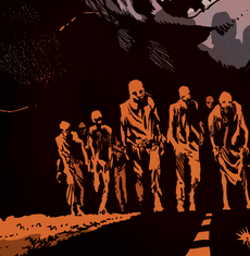
Holey smokes. Who knew Archie + zombies would equal what is one of the best comics on the stands? After leaving his friends safe at Veronica’s house, Archie goes to check on his parents, with heartrending results. Meanwhile, Jason and Cherry Blossom spend a quiet moment deciding on their future.
LIke the best horror, Afterlife With Archie is scary as hell, but also is heartbreaking and downright tender at times. While “mature” looks at classically children’s characters tend to work in the opposite direction, this comic does it perfectly. Roberto Aguirre-Sacasa obviously loves these characters, and while they are facing situations far more daunting than who Archie is going to take to the prom, they still are true to themselves. At the same time, the comic, is at its heart, an exploitation horror movie, and that’s nowhere more true than in the psychosexual incest drama playing out in the Blossom household
The art by Francesco Francavilla is absolutely beautiful. His Toth-influences show through and a dark color palette tinted with bright orange, adds a Hammer Horror Technicolor luridness to it. This book is billed as an on-going and I can only hope that Francavilla can keep up with it because his work adds so much (heh) life to it.
Joe Stando is reading…
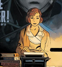 Lobster Johnson: Get the Lobster! #2
Written by Mike Mignola and John Arcudi
Art by Tonci Zonjic (pencils and inks) and Dave Stewart (colors)
Dark Horse Comics
“You! You radio and newspaper men have made this man a hero, and he’s not a hero!”
Lobster Johnson is an enigmatic character in the Hellboy universe. He’s a pulp hero reminiscent of the Shadow or the Phantom who is first introduced in continuity as a long-dead ghost. He seems to have fought Nazis and more arcane threats, but he’s also established to be the hero of radio and TV serials, including a luchador series. The Lobster’s history is intentionally vague and contradictory, and Get the Lobster! tangles the web further, even as it reveals his (possible) history.
This issue finds the Lobster as public enemy number one, as his brutal tactics against gangsters and criminals have finally pushed the police too far. Now, he has to contend with cops, as well as a scandalous newspaper expose against him and a mysterious wave of robotically augmented crime. Lobster Johnson himself is wisely kept out of the spotlight, with much of the dialogue focused on his allies and enemies among the police, media, and working class. Lobster Johnson works best as a pulp archetype, and the level of control Mignola has over the Hellboy franchise means he can be more distant and ominous than, say, Batman.
Tonci Zonjic’s art is perfect for this kind of a pulp narrative, as well. It has a Dick Tracy sort of feel, but with a level of subtlety that rivals Darwyn Cooke. Dave Stewart renders everything in almost sepia tones, accentuating the half-shadows that tend line character’s faces. All in all, it’s a beautiful, evocative comic. My only reservation in recommending it is that it may be a little dense for a first-time reader, but it plays to enough noir and pulp tropes that it should satisfy any fans of the genre.
Thanks for reading about what we’re reading! We’ll be back next week with a slew of suggestions from across the comics spectrum. In the meantime, what are you reading? Tell us in the comments section, on Twitter or on our Facebook Page!

