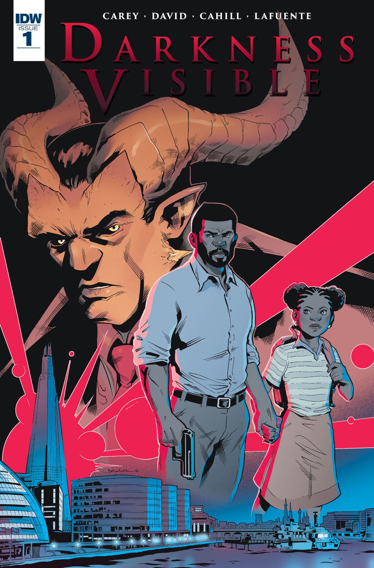
Deadshirt Is Reading… is a weekly feature in which Deadshirt’s staff, contributing writers, and friends-of-the-site offer their thoughts on Big Two cape titles, creator-owned books, webcomics and more.
David Lebovitz is Reading….
Darkness Visible #1
Written by Mike Carey & Arvind Ethan David
Art by Brendan Cahill
Colors by Joana Lafuente
Edited by Denton J. Tipton
Published by Ted Adams
IDW
“Well, living forever is a pretty big carrot, Mags. A lot of people don’t bother to check the small print.”
Darkness Visible is a perfect example of the dangers of dropping readers in media res without giving them enough context to understand the story. The comic introduces you to a big new world without any kind of guide or rubric. Imagine if someone mashed up Hellboy, Fables, and Men in Black, but forgot to explain any of it to you.
Darkness Visible takes place in a world where demons and humans coexist in an uneasy peace, but recently some of the demons have become crime bosses and terrorists. I think. Maybe. We’re not given any sense of character motivation, or given much of a way to differentiate between the seemingly vast numbers of demons. The story follows Detective Daniel Aston, who works for an organization called Cyclops, which seems to be the police of this world and…
I give up. This comic is clunky, confusing, and I see no reason to recommend it to you.
In this issue alone, we’re introduced to at least five people who figure to be major characters, but are given no backstory on them and no understanding how anything is connected. At one point, the main character guns down a demon god and he’s told, “You just brought down Simon Rhak, Nathan Ulescu’s right-hand beast.” We’re given no explanation who either of those people are, and I have a hard time appreciating someone’s accomplishment if I don’t know what they accomplished. The dialogue alters between clunky and corny, and all we know for sure is “this group of demons is bad” and “Aston loves his daughter.”
Reviewing first issues of new series is a tricky beast, and it often feels like I’m being tasked with explaining a world – but before I can explain a world, the world has to make sense, and it just doesn’t do that. The art is fine—edgy, creative demon designs with a ton of diversity in styles, and the coloring matches the moody, almost Gothic tone. But the comic is a waste of time. It has all the ingredients for a good comic, but ingredients are not the same as a finished product.
Thanks for reading about what we’re reading! We’ll be back next week with a slew of suggestions from across the comics spectrum. In the meantime, what are you reading? Tell us in the comments section, on Twitter or on our Facebook Page!


